Meghan Ryan
January 31, 2020
Color is one of the most subjective elements of design – it’s also one of the most important. Think about the last time you scrolled through your news feed – what stuck out to you? It probably wasn’t a wordy status update — instead, your eyes probably gravitated to the videos, pictures, gifs, and cat memes. Colorful visual elements do wonders in grabbing your audience’s attention and when you incorporate them well, they can turn a good presentation into a dazzling one. Read part 1 of our Designer tips series to learn about the role of color in design and how you can use color to enhance your presentations.
Color theory and the color wheel
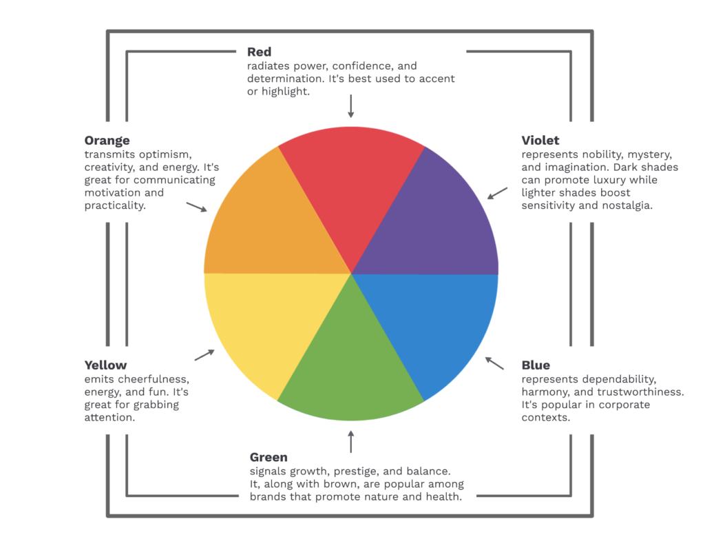
Artists often seem to magically pick out the perfect color combination, but oftentimes it’s because they rely on color theory and use the color wheel. Color theory is the process to choose color combinations that work well together. Meanwhile, the color wheel is a tool that can contain primary colors, secondary colors, tertiary colors, and shades, all arranged so that you can see how they relate to one another.
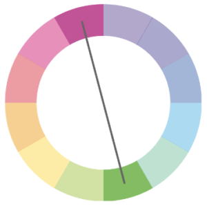
The color wheel above shows primary and secondary colors. Before you pick out a combination, choose one color from this wheel to be the main color of your design. Note that different colors can convey different meanings and will evoke different feelings in your audience:
- Warm colors (e.g., reds, oranges, yellows) are called “warm” because they tend to remind us of fire and the sun, and can be useful when conveying passion, happiness, energy, and confidence.
- Cool colors (e.g., blues, greens, purples) are more relaxing and calming than warm colors, and are great for professional designs.
Color combinations
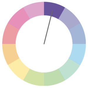
There are four tried-and-true methods for choosing a color combination. These methods use the color wheel for orienting colors against one another.
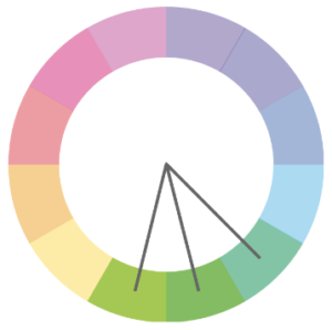
Analogous – Combine your main color with the two colors next to it on the color wheel. Analogous color schemes are not high-contrast combinations, so they’re typically used for backgrounds and softer designs. Autumn and spring color palettes are good examples of analogous color combinations.
Monochromatic – Another soft color palette is monochromatic, which consists of different tints, tones, and shades of one color. Monochromatic schemes look great in charts and graphs for a clean, polished effect.
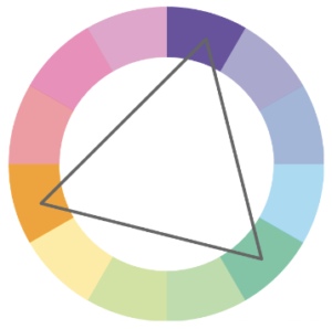
Triadic – Triadic color schemes are composed of three colors that form an equilateral triangle on the color wheel. These have a balanced effect without an overwhelming amount of contrast. Triadic color schemes are best used with one color as the main background color, and the other two colors used as accents. Perfect for when you want to point out key information.
Complementary – Complementary colors are opposite of each other on the color wheel. These are high-contrast color schemes that make the other colors pop, so they are best used when you want something to stand out.
Tints, shades, and tones
You can create lighter and darker versions of any color with tints, shades, and tones. The difference between the three is simply determined by the color added:
- A tint is created when you add white to a color, which lightens it.
- A shade is created when you add black to the color, this deepens and darkens the color.
- Tones are created by adding gray. Tones are subtler versions of the same color, and the gray can bring out complexities not seen in shades or tints.
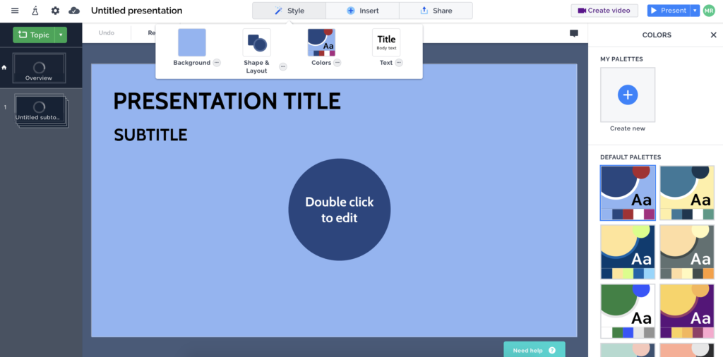
Incorporating tints, shades, and tones into your design is a great way to bring out more color without overwhelming your audience. In Prezi, you can find these color combinations in the editor’s Style menu. Click “Style”, then “Colors” to find default color palettes, or create and save your own palettes.
Common mistakes

Have you ever tried reading dark text over an equally saturated background? Your eyes probably hurt from looking at it. When two bold, highly saturated colors are used with text, it makes the edges look like they blur together as if the letters are “vibrating.” Neon colors can have a similar bleeding effect and should also be avoided, as they can strain your audience’s eyes.
Patterned backgrounds also make text difficult to read. When you have text in your presentation, opt for a solid color background or play with the opacity of a patterned background to ensure that the text stands out.
If you found these guidelines useful, check out Prezi’s step-by-step presentation on using colors for more information and visual examples.