We’re pleased to announce the release of Prezi’s latest UI update, designed to provide you with improved ease of use and accessibility. At Prezi, we prioritize the needs of our users, and this update is a direct response to our user’s valuable feedback and insights. We’ve listened attentively and are excited to introduce an interface that’s truly responsive to your needs!
With this update, our primary objective was to streamline the editing process, ensuring that you can easily navigate and access the essential features required for creating outstanding presentations. We’ve repositioned key functions carefully and refined the design, resulting in an interface that’s intuitive and efficient.
In addition to enhancing usability, we’ve also focused on enabling you to achieve your desired output more quickly. Functions such as sharing, presenting, and previewing have been made easily accessible, eliminating unnecessary steps and confusion. This time-saving improvement allows you to effortlessly share and showcase your work, making the process more convenient and efficient.
In the upcoming sections of this article, we’ll explore the fundamental changes and improvements introduced in this UI update. From a more intuitive top menu to enhanced settings and navigation, we’re confident that these updates will significantly improve your editing experience.
Streamlined top menu insert buttons
One of the notable changes in Prezi’s UI update is the introduction of new top menu insert buttons, replacing the three-button version. The new buttons offer a refreshed look and improved functionality. They feature distinct states, including neutral, hover, and pressed, allowing for a more interactive and responsive user experience. This change aims to simplify the process of inserting various elements and empowers users to create attention-grabbing presentations more efficiently.
Enhanced settings and navigation
Prezi’s new UI also focuses on enhancing the settings section and streamlining navigation. As part of this effort, we’ve introduced clear labels under the settings menu, ensuring that users can effortlessly navigate and locate specific options without the need for extensive searching. By reducing the number of settings, we aim to streamline the editing process, saving you valuable time and effort.
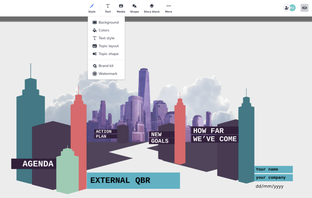
As part of this update, the layout options, also known as Topic layouts, have been relocated underneath the Style button to provide easier access and improved usability. This change ensures that you can quickly and intuitively explore and apply different layout options to your content. This new placement not only increases convenience but also encourages to explore and experiment with different layouts. It fosters creativity and allows for more engaging and dynamic presentations.

Ultimately, our commitment to simplicity and efficiency is reflected in these improvements. By prioritizing simplicity and reducing clutter, we strive to deliver a seamless editing experience that allows you to concentrate on what matters most: creating captivating presentations that leave a lasting impression.
Additional features and improved dropdowns
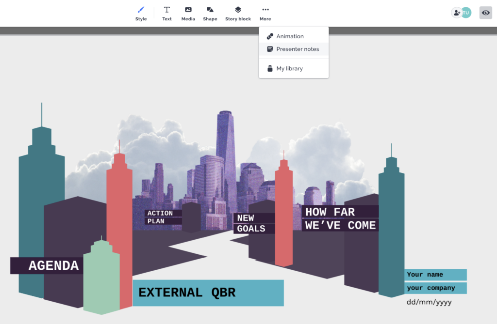
The UI update introduces additional features that can be accessed through the three-dot menu. This expanded functionality opens up new possibilities, particularly regarding animations and other engaging presentation elements. You can now easily incorporate captivating animations into your presentations, adding a dynamic and engaging touch to your content. Whether it’s subtle transitions or eye-catching motion effects, the functionality empowers you to seamlessly create stunning presentations that capture your audience’s attention. Furthermore, Presenter Notes can also be accessed conveniently under the three-button menu. This allows you to seamlessly add essential information and reminders readily available while presenting.

Also, the updated dropdown menus contribute to a more cohesive and visually appealing interface. By streamlining the interface, you can now access the necessary tools effortlessly and focus on crafting your content without any distractions.
Copy updates and tooltips
Prezi’s UI update also introduces a range of comprehensive copy updates and tooltips. These updates are designed to offer clearer instructions and guidance, making it easier for users to navigate the platform with confidence. By providing enhanced clarity, we ensure that you have the necessary resources at your disposal to create truly impactful presentations.
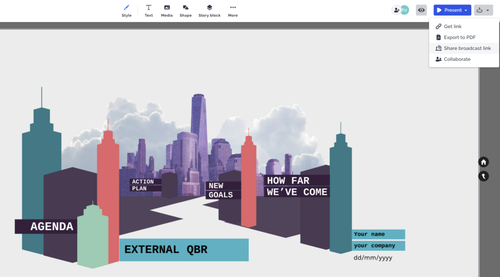
Moreover, the previously known Prezi Live feature has undergone a name change and is now referred to as the Share Broadcast Link functionality. This revised name better reflects the purpose and functionality of the feature. By utilizing this feature, you can send a personalized link to your audience and present your content in real-time. Whether you’re hosting a live event or conducting remote meetings, the Share Broadcast Link empowers you to share your Prezi presentations effortlessly, ensuring a smooth and immersive experience for all participants.

Detached property bar and layout improvements
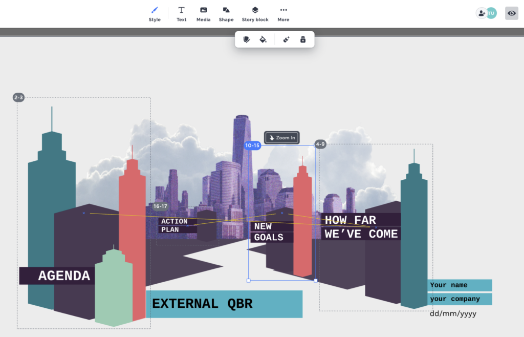
When you’re working on a creative project, you want the most necessary tools within your hand’s reach. The same applies when you’re designing a presentation. That’s where the detached menu comes into play as your handy toolbox, conveniently at your fingertips. Streamlining the editing process, the newly introduced detached property bar in the Prezi editor offers enhanced efficiency. This feature presents itself automatically when you select an object, providing quick and easy access to certain editing options. This functionality aims to improve productivity and ease of use, so all you need to focus on is your creative project.

Furthermore, you’ll notice a change on the left side of the interface. The hamburger menu now features a lower-opacity design, resulting in a visually streamlined experience. This adjustment further helps you focus on your content by minimizing unnecessary distractions, ultimately promoting a seamless and immersive editing process.
Unleash your creativity with Prezi
The redesigned interface brings a fresh and modern aesthetic and prioritizes ease of use and accessibility, elevating your editing experience in the Prezi editor. With a streamlined interface and strategically repositioned key functions, you can easily find and utilize the essential features necessary to craft attention-grabbing presentations that move. For more detailed information on this UI update, read our comprehensive support article or watch the video below!
Now get ready to unlock your creativity and make impactful presentations that truly move and inspire!
