Your choice of background is probably one of the most important aspects of your presentation. Selecting cool presentation backgrounds can elevate your story, engage your audience and set the tone for your message. Prezi’s unique open canvas gives you the creative freedom to design beyond the limitations of typical slides, allowing the background to play a dynamic role in guiding your content.
In this article, we’ll dive into cool presentation background ideas and explore specific examples. We’ll also highlight how Prezi’s features make it easy to choose, customize and apply cool backgrounds for presentations that will keep your audience captivated.

Why backgrounds matter in presentations
An effective background helps create atmosphere, adds visual interest, and subtly supports the topic of your presentation. Here’s why using a cool presentation background matters:
- Sets the tone: A background image or design can instantly convey the mood—whether it’s serious, inspiring, playful, or professional.
- Creates visual consistency: Choosing cool backgrounds for slides in a presentation can help connect different sections, guiding your audience seamlessly through your narrative.
- Increases engagement: A unique background catches the eye and can make your presentation feel more cohesive.
When you select and design your backgrounds carefully, they should work as a visual tool rather than overshadow your content.
How to choose the right background image for your presentation
Selecting the perfect background image is key because it’s a great way to improve your message. The right background can set the tone, reinforce your topic, and keep your audience engaged. Here are some tips for choosing one that fits just right:
1. Match the tone of your presentation
Think about the mood you want to convey. Are you presenting a motivational talk, a business proposal, or an educational workshop? For a calm, reflective tone, softer landscapes or abstract images work well. For a more energetic or inspirational feel, try vibrant colors or dynamic scenes like people in action.
2. Keep it relevant to your content
Choose a cool presentation background that complements your topic and adds depth to the message. As an example, if you’re discussing teamwork, you could use an image of people working together or achieving a shared goal to reinforce your message.
3. Ensure readability
A busy or overly bright background can distract from your text. Choose images with natural blank spaces or soft gradients where text can sit comfortably. Prezi’s open canvas allows you to adjust text placement, so take advantage of this flexibility to ensure every word is clear and easy to read.
4. Consider the audience
Who are you presenting to? For a corporate or professional audience, sleek, minimal backgrounds might be more suitable. If your audience is creative or informal, feel free to experiment with playful or vibrant backgrounds. Knowing your audience will help guide your design choices and ensure your presentation resonates.
5. Test how it looks on different devices
Just because your background looks great on a computer screen, that doesn’t mean it will translate well to smaller screens like tablets or phones. Always test your presentation on different devices to make sure that the background remains impactful and doesn’t lose its effect.
By considering these aspects, you’ll be better prepared to pick a cool presentation background that looks great and also adds depth and clarity to your presentation.
Cool background ideas for your presentation
If you’re looking to make a lasting impression, here are some cool presentation background ideas and specific images that can add an extra touch to your presentations:
1. Abstract and pastel colors

Best for: Creative topics, product pitches, and design showcases.
Why it works: Abstract pastels offer a soft yet vibrant appeal, adding color without overwhelming your content. Use them for presentations where you want a creative but calm aesthetic.
2. Minimalist architecture
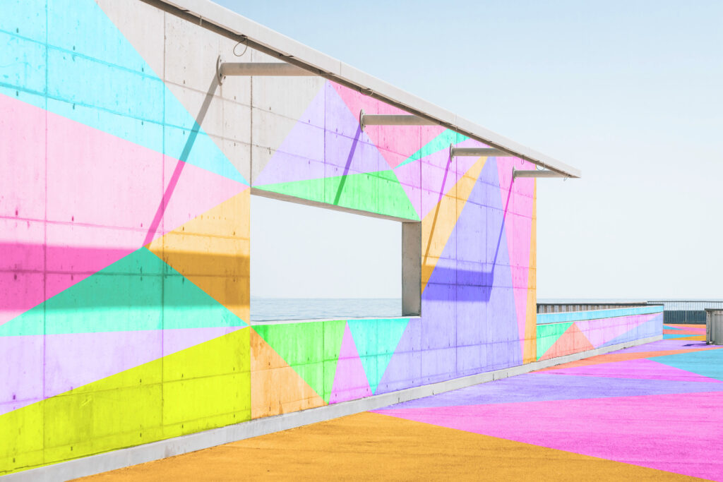
Best for: Architectural presentations, urban design topics, and innovative technology talks.
Why it works: The clean lines and pops of color in minimalist architectural backgrounds add a sense of sophistication and modernity, ideal for professional or educational presentations.
3. Nature-inspired visuals

Best for: Environmental topics, wellness themes, or travel-related presentations.
Why it works: Nature images bring a refreshing, organic quality to your slides, creating a calming visual experience that’s perfect for themes related to health, sustainability, and exploration.
4. Adventure and landscape scenes

Best for: Motivational talks, personal stories, or adventure and travel content.
Why it works: Landscape images inspire a sense of wonder and exploration which make them ideal for presentations focused on self-improvement, personal journeys, or outdoor topics.
Dynamic animal visuals

Best for: Presentations on strength, resilience, or nature conservation.
Why it works: Animal imagery, especially with strong symbols like tigers, adds a powerful, dramatic element to your presentation. It can symbolize strength, courage, or a specific theme in your message.
6. Minimalist color geometry

Best for: Modern design, minimalism, and artistic presentations.
Why it works: This geometric background has a clean, structured aesthetic that adds a touch of sophistication, making it ideal for presentations with an artistic or innovative theme.
7. Penguins on ice

Best for: Environmental themes, science topics, or presentations focused on teamwork, togetherness.
Why it works: The adorable scene adds both charm and a fresh, nature-inspired color palette, which can lighten the mood and make scientific or ecological presentations more engaging.
8. Dynamic aerial running shot

Best for: Sports, motivation, or adventure themes.
Why it works: The sense of movement and perspective brings energy to your slides, making it ideal for themes centered around action, motivation, and personal growth.
9. Desert landscape and sand dunes

Best for: Travel, exploration, and adventure topics.
Why it works: This expansive, earthy landscape gives a sense of scale and wonder, adding depth to your presentation. It’s perfect for themes that focus on exploration or personal journeys.
10. Climbing to the top

Best for: Goal-setting, motivational, or team-building presentations.
Why it works: This image of a climber ascending a mountain evokes themes of perseverance and ambition which make it perfect for presentations focused on achieving goals, overcoming challenges or teamwork.
The role of color in presentation backgrounds
When selecting a cool presentation background, color choice plays a significant role in setting the mood and improving readability. The colors you choose for your background can evoke specific emotions and make a difference in how your audience absorbs the information. Here are some considerations for making the right color choices:
1. Align with your brand or theme
If you’re presenting on behalf of a brand, you should select background colors that match your brand palette. This helps create a cohesive experience and reinforces brand identity. For themes related to creativity or innovation, bold colors may add excitement, while muted tones work well for corporate settings.
2. Use color psychology to influence mood
Different colors evoke different emotions. Blue, for example, conveys calm and trust, making it ideal for educational or corporate settings. Yellow and orange add energy and enthusiasm, fitting for creative presentations or motivational topics. Understanding color psychology can help you choose a cool presentation background that subtly influences your audience’s mindset.

3. Ensure contrast for readability
Strong contrast between background and text is essential for readability. Light-colored text on a dark background, or vice versa, ensures that your audience can read every point clearly. Prezi’s customization options allow you to experiment with color contrast until you achieve a balance that looks great and keeps your text readable.
Cool presentation backgrounds from Prezi templates
Prezi offers a variety of unique templates with cool presentation backgrounds ready to use, so you can skip the search and start creating right away. Here are some standout templates that feature visually engaging backgrounds:
1. Sales Process Road

This template features a cool presentation background that’s ideal for guiding viewers through steps or processes with a roadmap-inspired design. It works well for business or educational presentations where clarity and visual flow are essential.
2. Constellations AI-Assisted
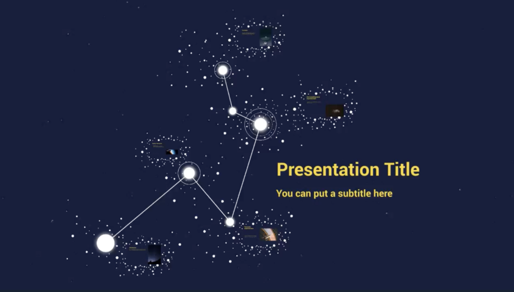
This template’s starry background is perfect for topics related to technology, astronomy, or innovation. It gives a futuristic vibe that captures the viewer’s imagination.
3. Employee Onboarding Dark
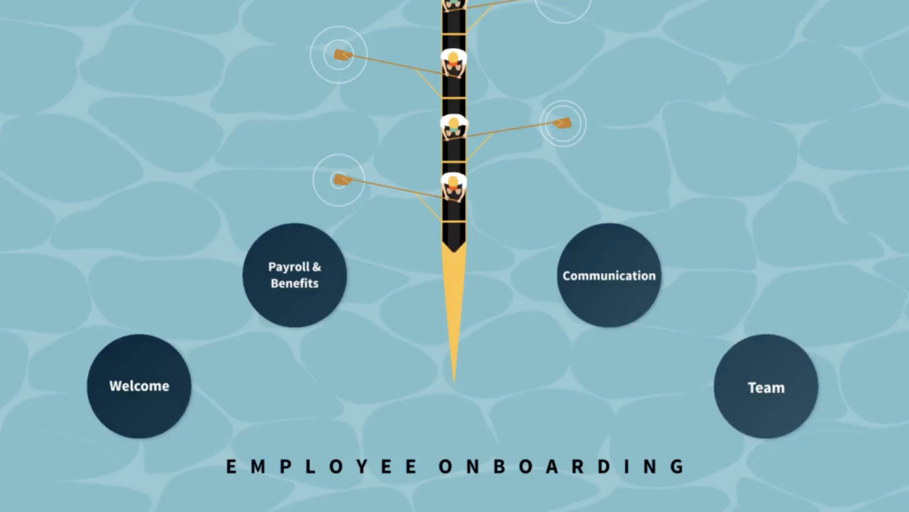
This template has a dark, professional tone, yet the light blue background adds a pop of character that makes it more interesting to look at. You could use this template for corporate or formal presentations, such as employee training sessions or company updates.
4. Creativity Paper

This creativity-inspired background is both artistic and grounded, with a good use of bright colors, making it a great fit for topics around creativity, arts, or education.
5. Personal Storytelling Office
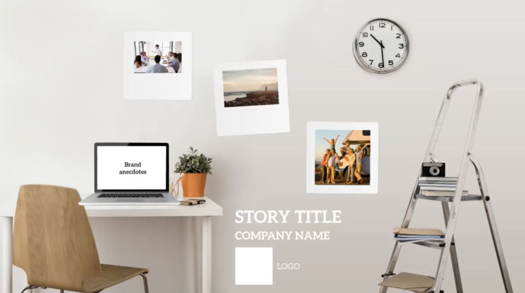
This cool presentation background offers a casual office vibe with a minimalistic approach, ideal for personal storytelling or presentations focused on career development.
6. Business Planning

Featuring a structured, clean design, this cool presentation background works well for business strategy, planning and financial presentations, giving a polished look without distracting from the content.
How Prezi’s open canvas elevates your background options
Prezi’s open canvas format provides a dynamic space where you can fully utilize the background in creative ways:
- Layered storytelling: Unlike traditional slides, Prezi’s open canvas lets you layer content over a single, expansive background. You can zoom in on different parts of the canvas, creating a story that unfolds visually.
- Engaging transitions: Use seamless transitions to move from one part of your background to another. This allows for fluid storytelling, where each transition feels intentional and emphasizes your message.
- Highlight key points: Prezi allows you to design paths and zoom effects that bring the focus to specific areas, making your background an active part of the storytelling process. This can be particularly effective for timelines, roadmaps, or any presentation that benefits from a non-linear flow.
With Prezi, the background is more than just a backdrop—it’s a visual asset that becomes part of your storytelling toolkit.
How to use Prezi’s background library
One of the benefits of using Prezi is access to a wide variety of cool presentation backgrounds directly within the platform. Here’s how to make the most of this feature:
- Browse diverse categories: Prezi’s library covers everything from landscapes to abstract art, making it easy to find cool presentation backgrounds that suit your presentation style.
- Customize with colors and filters: Adjust the colors or apply filters to your chosen background, ensuring it complements your content without distracting from it.
- Experiment with transparency: If you want to add more subtlety, you can adjust the transparency of the background image to create a softer effect. This keeps your content readable while adding a creative touch.
With Prezi’s library, you have all the cool backgrounds for a presentation that you could possibly need, so you don’t have to search for images elsewhere.
Final thoughts on cool presentation backgrounds
Selecting a cool presentation background can transform your presentation, adding both style and substance. With Prezi’s open canvas and expansive background library, you can explore endless creative possibilities to find the perfect backdrop for your message. Whether you’re aiming for something minimalist, adventurous or visually rich, Prezi gives you the tools to make every presentation visually unforgettable. So next time, go beyond the basics—try out different cool presentation backgrounds and see how a creative backdrop can elevate your storytelling.
Looking for more ideas? Discover good presentation backgrounds that’ll grab your audience’s attention.
