Rachel Wells
November 03, 2025
When was the last time you remembered a single line from your most recent all-hands meeting?
Within just one week, most audiences forget up to 90% of what they hear in a presentation. Think back to your last meeting. Can you recall the key slide or quote that truly resonated? Chances are, you remember the feeling more than the facts. That gap between what’s said and what sticks costs companies millions in lost persuasion, productivity, and opportunity.
On average, half of a presentation is forgotten before the day even ends. So, how do you ensure your ideas last longer than the slides?
In this article, I’ll explore the science of memorability: why visuals, structure, and emotion determine what people remember. I’ll also show you how Prezi AI helps you craft presentations that move, engage, and leave a lasting impression.

Why do people forget most presentations?
If your audience forgets your presentation, it’s not because it wasn’t good. It’s because our brains will naturally forget most information. Whether it’s delivered on a slide deck or not doesn’t matter.
The science behind forgetting
I’ve been researching why some people’s presentations are etched firmly in my memory while others lull me to sleep, and in the course of my research, I discovered some really fascinating patterns in how storytelling, emotion, and visual design work together to make information stick.
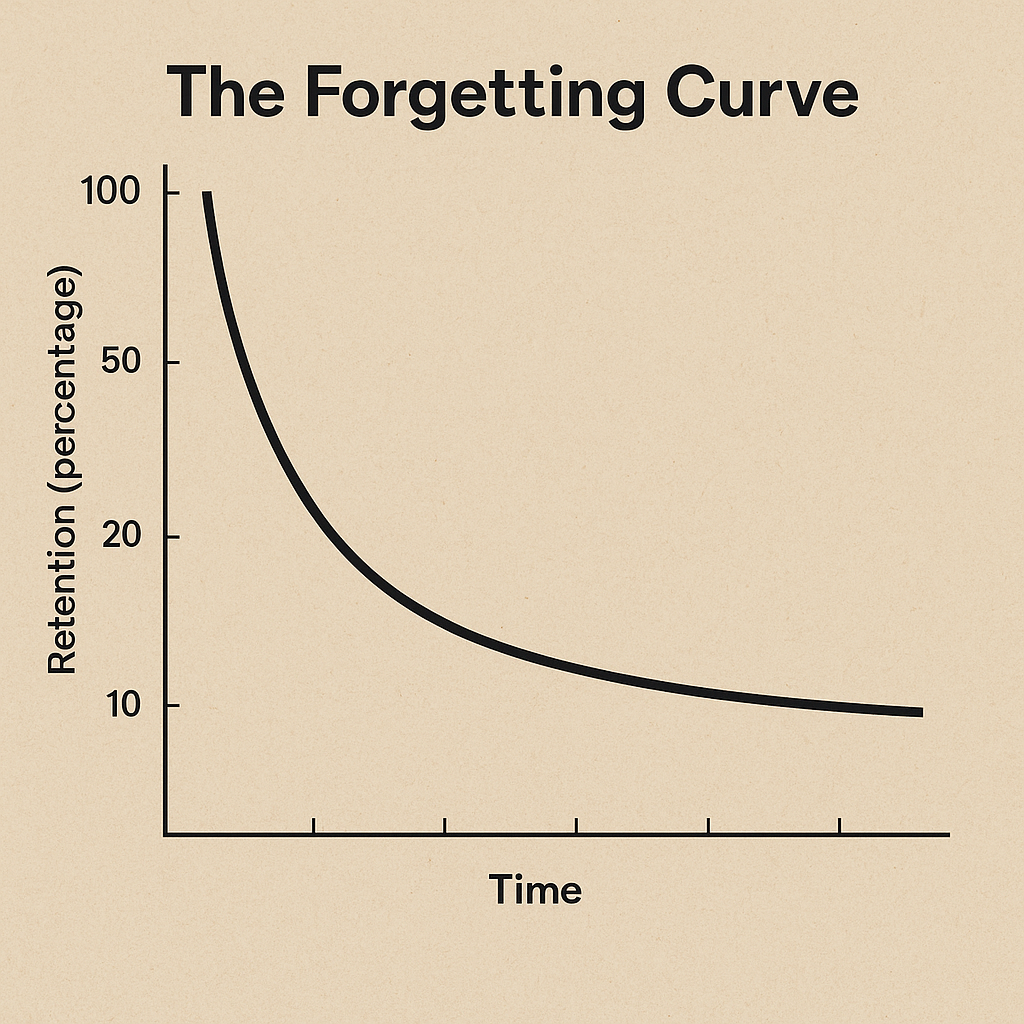
Over 100 years ago, German psychologist Hermann Ebbinghaus uncovered one of the most important principles in memory research: the Forgetting Curve. His experiments showed that memory retention drops by 50% within 24 hours and up to 90% within a week, unless the information is reinforced.
Modern neuroscience research confirms the same pattern: the brain filters out most new information automatically to conserve energy and focus on what feels meaningful or emotional.
What the Forgetting Curve means for presenters
Your message will only make it into long-term memory if it’s delivered in a way that gives the brain a reason to keep it.
People remember content that is:
- Emotionally engaging — Emotion acts as a “memory tag,” signaling importance.
- Visually anchored — The brain processes images up to 60,000x faster than text, according to an MIT study.
- Repeated strategically — Spaced repetition reinforces neural pathways for recall.
Quick recap:
- Science: The Forgetting Curve.
- Key finding: 50% of information is forgotten in 24 hours; 90% in one week.
- Core reason: The brain filters information instead of storing it.
- Memory triggers: Emotion, imagery, repetition.
Why it matters
Your job as a presenter is to do more than simply share information. Your role has a dual purpose: to educate/inform/inspire, and to turn that magic switch in the audience’s brains so their memory decides, “This is worth keeping.”
And that’s where Prezi’s cinematic storytelling gives your message a lasting edge, because it engages emotion, vision, and repetition naturally through movement and design.
“Death by PowerPoint”
We’ve all been there. The lights dim, the slides appear, and within minutes, your attention fades. Endless bullet points. Walls of text. The presenter is reading verbatim from the screen.
Or, at an online meeting, it’s the infamous “Can you see my screen?” that turns everyone off. And inwardly, you can’t wait for the nightmare to be over. We’ve nodded off to sleep, checked our phones, or caught up on emails and important action items while the presenter and their slides were on a background window. It’s what people jokingly call “death by PowerPoint.”
The problem isn’t so much the tool itself, but it’s more to do with how most presenters use it. Cognitive science shows that our brains simply aren’t built for this kind of overload.
Less is more
One of my favorite books on the topic of communication skills and presentation delivery is Stop Talking, Start Influencing, by neuroscientist Dr. Jared Cooney Horvath. In his book, Dr. Horvath explains that working memory can only process a few elements at a time before performance collapses. Once that limit is exceeded, comprehension and recall fall sharply.
When slides are packed with dense paragraphs or complex charts that take longer than a few seconds to decode, here’s what happens:
- The brain can’t decide what matters. Competing signals block focus.
- Information stays stuck in short-term memory. It never transfers to long-term recall.
Audiences experience mental fatigue, so instead of engagement, they feel cognitive strain.
Our brains can handle only one major input channel (visual or auditory) at any given moment. So when the audience is forced to listen and read simultaneously, both channels compete for processing power. As a result, neither the message nor the visuals stick.
The raw-data problem
Most presentations are forgotten because the content is soulless. When your audience is bombarded with charts, numbers, and bullet points without story, emotion, or structure, the brain treats it as though it’s unwanted background noise.
Raw data lacks the cues our memory needs to tag information as important. Without emotion or spatial context, it doesn’t make it past short-term memory. That’s why your audience can likely recall how many slides you had (too many, perhaps?) but not what you said on them.
In other words, people tend to forget data when they feel disconnected from it.

Unfortunately, this is an all-too-common trap that many executives, technical professionals, and data science professionals find themselves falling into, and it’s understandable. You’re faced with raw data, and it’s not always going to look sexy.
Sometimes it bores you just looking at it, and you have no idea how to capture interest, attention, and buy-in from lifeless stats. But, at the same time, you know the data is needed.
That’s why, later in this article, I’ll explore exactly how to turn that around, and how you can infuse facts with story, emotion, and spatial storytelling using Prezi AI. So, keep reading!
Quick recap
- Concept: Cognitive Load Theory
- Finding: Overloaded slides trigger working-memory collapse, and text-heavy decks result in disengagement and poor recall.
- Solution: Use visuals and one-liners to lighten the brain’s load; Prezi’s AI tool helps you accomplish this easily, in less than a minute, with just a single prompt. And finally, balance out the raw data using the tips provided in this article.
Why this matters for presenters
Every extra line of text competes for limited mental bandwidth. This explains why the more text you squeeze onto your slides, the less your audience remembers. To be honest, just one or two lines or just one core idea per slide would suffice.
To arrest and maintain your audience’s attention, you need to design for clarity as opposed to density. It’s tempting to throw everything into one slide when you’re rushed for time, but you can’t afford to overlook this step: separate your ideas clearly and concisely.
That’s exactly where Prezi’s cinematic storytelling canvas stands apart. It helps you guide focus through movement and space rather than cluttering slides with competing words.
With Prezi, you can instantly declutter dense content, auto-balance visuals and text, and highlight only what the brain can comfortably process. This results in presentations that feel effortless to follow and impossible to forget.
Why text-only presentations fail — and visuals win
Words alone rarely stick. Science proves it.
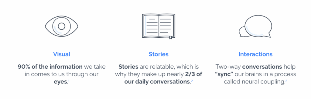
In Brain Rules, developmental molecular biologist Dr. John Medina found that people remember only about 10% of what they hear or read after 72 hours. But when that same information is paired with a relevant image, retention jumps to 65%.
Isn’t that fascinating? This is known as the Picture Superiority Effect, which is simply the principle that the brain prefers to process and store pictures over words.
The brain’s visual bias
Our visual cortex processes images up to 60,000 times faster than text, making visuals the brain’s primary language. Research also demonstrates that we store verbal and visual information in separate channels, and when both fire together, recall strengthens dramatically.
Simply put: if you want people to remember, show them.

When slides rely solely on words, three things happen:
- Memory decays without visual reinforcement.
- Cognitive overload limits how much can be processed at once.
- Attention fades quickly. Today’s research shows the average human attention span is 47 seconds (American Psychological Association). So you’re doing yourself a disadvantage with text-heavy slides.
Visuals boost recall because they create emotional and spatial anchors.
How to design the way the brain learns
So, putting all of these concepts together, to make your message stick, design your presentation the way the brain naturally learns: visually, spatially, and emotionally.
That’s where Prezi’s dynamic canvas gives you an edge. Instead of static, text-heavy slides, Prezi lets you move across a visual landscape of ideas, zooming in for detail, panning out for context, and connecting topics through spatial relationships.

Prezi’s movement-based storytelling mirrors how memory forms, which is through association, motion, and meaning, and this helps your audience remember not just what you said, but how it felt to experience it.
How to make your presentations more memorable and impactful
Every business professional has faced the awkward scenario of presenting data that feels lifeless, especially if you work in a role that doesn’t seem as “exciting” and transformational as sales. With rows of numbers and charts full of figures, important information somehow lands flat. You’re bored presenting it, and your audience is bored hearing it.
The fix isn’t more slides or more data. It’s actually…storytelling.
1. Why storytelling works
Storytelling is one of the most powerful tools for capturing attention and creating long-term recall. This is because, when you tell a story, your audience’s brain responds as if they’re inside it.
Research from the Stanford Graduate School of Business reveals that stories are up to 22 times more memorable than facts alone, because they trigger narrative transportation—a phenomenon where our sensory, emotional, and motor cortices activate as though we’re living the experience ourselves.
That emotional simulation builds empathy, trust, and retention far more effectively than data ever could.
Communication expert Carmine Gallo, in Talk Like TED, analyzed one of the most-watched TED Talks ever: “We Need to Talk About an Injustice” by civil-rights attorney Bryan Stevenson.
The most intriguing thing about his talk was that Stevenson didn’t show a single chart. He told raw, human stories about justice and dignity. Gallo found that over 65% of his content appealed to pathos (emotion), with the rest supported by ethos (credibility) and logos (logic).
The impact of his storytelling was impressive: listeners donated more than $1 million to Stevenson’s nonprofit within 24 hours, without a direct ask.
The pathos–ethos–logos framework
Don’t start designing the outline of your next presentation without bearing this framework in mind:
| Element | Meaning | Why it matters in business presentations |
| Pathos (Emotion) | Connects through feeling. Evokes empathy, urgency, or excitement. | Emotional resonance makes ideas “stick.” |
| Ethos (Credibility) | Builds trust through experience, data, or reputation. | Establishes authority so audiences believe you. |
| Logos (Logic) | Supports claims with facts, evidence, or reasoning. | Gives your story structure and proof. |
The best presentations balance all three, but the most unforgettable ones start with emotion and weave logic and credibility through it.
Practical tips for storytelling in work presentations
- Open with a human moment. Begin with a real customer, colleague, or insight that grounds your data in emotion.
- Frame data as discovery. Present numbers as the “plot twist” that changed your perspective.
- Build narrative flow. Move from challenge → insight → outcome.
- End with transformation. Show what changed because of the data.
How Prezi helps you tell the story
Most presentation tools move slide by slide as a linear path that fragments emotion. But Prezi’s cinematic storytelling lets you reveal your story the way the brain experiences it: through motion, space, and connection.
With Prezi AI, you can:
- Transform bullet points into story arcs that highlight tension and resolution.
- Match tone to intent, whether persuasive for clients or inspiring for teams.
- Zoom into emotional moments and pan out for big-picture context, mirroring the rhythm of a live story.
By pairing storytelling psychology with Prezi’s movement and AI intelligence, your data turns into a journey that your audience can see, feel, and remember.
Here are some story angles to inspire you ahead of your next presentation:
Five story types that turn data into emotion
- The Personal Journey – Reveal a defining moment that connects your “why” to your audience’s.
- The Customer Story – Showcase the real people behind your metrics and outcomes.
- The Data Story – Treat data as the plot twist, not the plot.
- The Vision Story – Paint a vivid “what if” scenario that lets people imagine success.
- The Challenge-Resolution Story – Use conflict and transformation to build tension and payoff.
What other storytelling angles can you think of?
2. Why presentation layouts matter
Design is more than merely aesthetic. Recent research shows that where you place content on the screen matters as much as what you say.
What research says
- A 2025 systematic review found that spatial memory plays a pivotal role in learning and achievement, particularly in design contexts. ScienceDirect
- A 2024 virtual-reality study revealed that participants interacting with spatial layouts showed different recall accuracy based on how they encoded locations. Nature
- A 2024 study on egocentric (body-centered) vs allocentric (map-centered) spatial memory found that memory performance was stronger when content was tied to the viewer’s perspective, which means that presentations that reflect user context boost recall. Journal of Cognition
From these scientific studies, we understand that the brain doesn’t just store plain information, but it also stores where and how that information appeared. Using spatial cues, movement, and structure gives your content a memory “hook.”
Three spatial principles for better presentations
- Anchor ideas visually and spatially. When things appear on different parts of a canvas (left vs right, top vs bottom), our memory assigns “location” to ideas, helping retrieval later.
- Use movement to reinforce structure. Zooming in, panning across, or shifting sections creates mental transitions. Those transitions act like “landmarks” in your story.
- Match layout to perspective. If your audience sees the story from their viewpoint (egocentric), they remember more. Design so they feel part of the narrative, not detached from it.
How to design Prezi presentations that hold attention at work
- Build a visual map of your presentation. Start with your main message in the centre of a canvas. Branch out supporting ideas around it so each has its spatial location.
- Use motion intentionally. Zoom in on a key statistic, pan out to show market context, then pan sideways to show next steps. These movements help the brain anchor concepts.
- Segment into spatial zones. For example: Solve → Strategy → Result. Each zone lives in a distinct area of your canvas so when you revisit, the learner “returns” to that zone.
- Reinforce with consistent positioning. If you always place “challenge” on the left and “outcome” on the right, you’re encoding not just the words but the position—meaning when you reference it later (“Remember what was on the left?”) memory triggers more easily.
- Viewpoint matters. Make it personal: Use “you” language and visuals that simulate the audience’s perspective (egocentric), not just a third-person observer view.
How Prezi leverages spatial science
Prezi’s canvas is not a sequence of slides, unlike your typical PowerPoint or Canva slide deck. Prezi creates a spatial storytelling environment.
- Each topic lives in a zone on the canvas, giving your audience a “mental location” for each idea.
- Zooming and panning create transition landmarks, just like moving through physical space helps memory.
- Spatial design in Prezi mirrors how our brains map information, since it mimics a story journey rather than a list of slides.
How to use AI presentation tools
AI-augmented presentation design is a partnership between human creativity and machine intelligence.
Instead of replacing storytelling, it refines and boosts its effectiveness.

AI helps you:
- Generate structure: turn scattered thoughts into clear, logical narratives.
- Tune emotion: analyze tone and pacing so your story resonates with the right energy.
- Enhance visuals: recommend imagery, metaphors, and layouts that mirror how the brain remembers.
- Coach performance: give real-time feedback on clarity, pacing, and delivery.
In short, AI amplifies the human touch, transforming raw ideas into emotionally intelligent, data-driven stories.
Why you should use AI presentation tools
AI’s power lies in pattern recognition. Trained on millions of data points, including speeches, presentations, and audience interactions, it can easily help you identify what holds attention and what causes disengagement.
For example, you can use it to:
- Detect tone imbalances (too dry, too formal).
- Predict when attention might fade.
- Select visuals that create emotional or spatial anchors.
- Keep message, design, and tone consistent.
Because of this strategic collaboration, you’re able to get AI-powered presentations that aren’t just pleasing on the eye but are also neurologically optimized for memory.
And with tools like Prezi AI, these capabilities come built in, helping you craft attention-grabbing presentations that move and stick.
Why Prezi is the leading AI presentation design tool
- Neuroscience-aligned design: spatial storytelling mirrors memory formation.
- Emotion-driven visuals: reinforces tone through motion and color.
- Time-saving automation: outlines and layouts in less than a minute (you can literally type in a short sentence with your idea and it will generate the outline for each slide, as well as the content and design).
- Audience-tailored tone: adapts design for different contexts.
- Collaboration-ready: built for hybrid and remote teams.
Using Prezi AI is unlike any design tool you’ve ever used before. Prezi has been trained on more than 500 million presentations, so you’re definitely in safe hands. It knows exactly what works, what doesn’t, and why audiences remember certain moments after the slides fade.
What it’s like to use Prezi AI
When I started using Prezi AI, instead of it forcing me into some cookie-cutter template like so many other presentation designers, I noticed that Prezi designed around my story. I simply start typing what I want to say, and it analyzes the message, including the structure, tone, and intent. Then it builds a layout that feels custom-fit. It’s as if the AI understands what I’m trying to communicate before I’ve fully articulated it myself.
And that’s what makes it so powerful. Prezi has been trained on years of design and memory science and understands the spatial layouts, visual hierarchies, and storytelling patterns that hold attention and make content stick. So instead of fighting with formatting or spending hours moving text boxes around, I can focus entirely on my story and the outcome I want to create.
Every time I use it, I feel like I’ve skipped straight past the “blank canvas” phase and gone right into refinement. It’s smart enough to choose the best structure for what I’m saying, but flexible enough to keep my voice intact. It’s the kind of creative collaboration that feels human, even though it’s powered by AI.
Other AI tools that support great storytelling
AI can streamline every stage of your presentation workflow—from drafting to design—but not all tools are built the same. Here are a few that complement your creative process:
- Grammarly: Refines tone and clarity so your words sound confident, not stiff.
Best for: polishing speaker notes or scripts before you present.
- Microsoft Copilot – Acts like a rehearsal partner, giving live coaching on pacing and tone.
Best for: refining delivery and timing.
- Midjourney / DALL·E – Generates custom imagery and metaphors that bring abstract ideas to life.
Best for: creating supporting visuals inside your Prezi canvas.
- ChatGPT – Helps you ideate each part of your presentation design process and works well with Prezi
Best for: developing the content and making psychologically-backed recommendations for presenting your ideas
Each of these tools helps simplify part of the storytelling process, but only Prezi AI is designed around how people actually remember stories. It pairs AI’s intelligence with cinematic motion and spatial design, helping your ideas move, connect, and stay unforgettable.
How to use Prezi to spark storytelling and design ideas
Even the best presenters sometimes stare at a blank page, unsure how to start shaping a story or visual direction. That’s where Prezi’s built-in AI chat can help.
Prezi AI can act as your creative co-strategist so you can brainstorm story frameworks, structure slides, and generate visual ideas that complement Prezi’s spatial design.
Try these seven context-specific prompts (and don’t forget to iterate them) to jump-start creativity for your next presentation. As a pro tip, start off each prompt with, “You’re an expert presentation coach and your role is to help me present my ideas concisely and in a way that is memorable, leads to action, and is truly impactful.” This is called persona-based prompting, and it helps Prezi AI to step into the shoes of a presentation coach and generate more effective outputs.
1. Sales presentation prompt
“I’m preparing a sales presentation for [product/service] aimed at [audience type]. Create a storytelling framework using the Challenge–Solution–Impact structure. Suggest three emotional hooks I can use in my opening story and recommend visuals that align with each phase. Keep it concise and persuasive for executive buyers.”
What this does: Generates a story arc you can instantly visualize in Prezi’s canvas: problem on the left, solution in the center, results on the right.
2. Marketing strategy presentation prompt
“Help me craft a marketing strategy presentation that feels cinematic and inspires action. Use the StoryBrand model (character, problem, guide, plan, call to action). Include one metaphor or visual theme that can run through all sections, something that would look strong in a Prezi zoom-and-pan layout.”
Why it works: Prezi connects logic and emotion, providing a unifying metaphor you can map spatially in Prezi (e.g., “a journey through a digital landscape”).
3. Partnership meeting prompt
“Generate a persuasive narrative for a partnership pitch between [Company A] and [Company B]. Frame it as a shared-vision story: where we are now, what the world looks like if we collaborate, and how our joint impact changes the market. Suggest visuals or spatial sequences to show this transformation inside a Prezi presentation.”
Result: A co-ownership storyline where each partner’s contribution has a defined space on the Prezi canvas.
4. All-hands meeting prompt
“I’m leading an all-hands meeting to update the company on goals and morale. Create a warm, story-driven structure that blends company achievements with employee stories. Include one interactive idea or question to re-engage attention every five minutes, and suggest how I can visualize progress in Prezi’s dynamic canvas.”
Why it works: Keeps employees emotionally invested while avoiding information overload—ideal for Prezi’s zoomable overview of milestones and people.
5. Team update prompt
“Help me design a short, energizing team update for [department]. Structure it around three mini-stories: a win, a challenge, and a next step. Recommend tone, pacing, and a few imagery ideas that will feel authentic and motivating. Assume I’ll build this in Prezi with simple zoom transitions.”
Why it works: Great for weekly or monthly updates. Prezi provides fast story outlines and tone guidance that Prezi can instantly visualize.
6. Leadership quarterly review prompt
“I’m presenting a quarterly business review to the leadership team. Create a storytelling outline that connects financial results to human impact. Suggest how to use data storytelling, where the data becomes the ‘plot twist.’ Include one recommendation for a spatial flow I can design in Prezi to make trends easier to remember.”
Why it works: Turns dry numbers into a leadership narrative of “here’s what we achieved, what it means, and what happens next,” all supported by Prezi’s spatial storytelling.
7. New initiative or vision launch prompt
“Draft a storytelling outline for launching a new company initiative. I want it to inspire belief and action. Use a three-act structure (tension → revelation → transformation) and suggest strong visual metaphors, such as a horizon or path, that I can bring to life in Prezi’s zoom transitions.”
Why it works: Prezi AI gives you a cinematic script which then converts into a tangible journey when you’re ready.
How to get the most from these Prezi AI prompts
- Be specific. Add your audience type, timeframe, and goal for better outputs.
- Iterate. Ask Prezi AI follow-ups like “Make it more story-driven” or “Simplify for non-technical stakeholders.”
- Pair with Prezi AI. Once you have your outline, Prezi AI can instantly translate that narrative into a spatial story map, with tone-matched imagery and movement suggestions.
When you combine Prezi AI’s brainstorming power with motion-based storytelling, you move beyond slides to create experiences that audiences feel, remember, and act on.
So far in this article, you’ve learned about why people forget up to 90% of what is said in presentations; you now understand the science behind an exceptionally great, memorable presentation, and you’ve learned the building blocks of presentations that are (almost) just as impactful as your favorite TED talks.
You now know how to combine AI, storytelling, and spatial layouts to design presentations that resonate with your audience. And now, you’re closer to landing your next partnership, secure a leadership job offer, or gain stakeholder buy-in, through presentations that move people.
Whether you’re presenting to clients, leading a team meeting, or inspiring a room full of executives, the science is clear: audiences remember visuals, structure, and stories. Tools like Prezi AI make it easier than ever to bring those elements together into one seamless, cinematic experience.
Simple actions you can take now
- Map your next presentation visually. Start with your core idea, then build outward like a story map.
- Add emotion early. Open with a story, question, or visual that matters to your audience.
- Experiment with AI. Use Prezi to build your structure, choose visuals, and preview your motion flow.
- Try it risk-free. Stop losing 90% of your message. Start building presentations that people remember with a 14-day free trial and see for yourself why movement and memory go hand in hand.
Your story deserves to be remembered. Prezi helps make that happen.