Meghan Ryan
May 07, 2020
More people than ever are connecting through visual content. Teachers and business professionals alike are turning content they may have delivered in-person into presentations and videos that they can share online. The higher quality content that they’re able to make, the greater impact their designs can deliver. With a keen awareness of how to use color, you can avoid major pitfalls in design and make your content look more beautiful and professional than ever.
Read part 2 of our designer tips series to learn about the top color mistakes you should avoid and how to arrange color with the 60-30-10 rule.
Color mistakes you should avoid
Fortunately, simply staying away from certain color combinations can elevate your designs. Be sure to avoid:
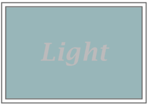
- Light on light
If you’re including text when designing your presentation, make sure it’s readable by contrasting the text with the background color. Two light colors might look nice paired together, but they aren’t always very legible.
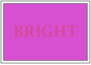
- Bright on bright
Just as viewers will struggle to read content with two light colors, they’ll have just as hard a time reading bright text on top of a bright background. Bright text pops so much more when it is written over a subtle background color. The same is true for dark text.
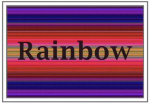
- Vibrating colors
When two bold, highly saturated colors are paired with each other, the lines between the two colors seem to blur and mix, giving the illusion that the colors are “vibrating”. This can cause a headache for someone trying to read the text, though it could be even more problematic for people with color blindness, as they may not be able to make out the text at all. There are many levels of color blindness, though it is best to avoid highly contrasting, vibrating colors as a rule.

- Patterns behind text
Your text has to stand out from its background in order to be legible, so avoid having busy, contrasting graphics in your background that your text can get lost in. Instead, opt for a plain, solid color background. If you must use graphics, lower the opacity to make sure the text has a chance to stand out.
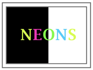
- Neons
Neon colors are eye-catching, but using these colors too much can be irritating and tiresome for your viewers. Use neons sparingly or as accents in your designs.
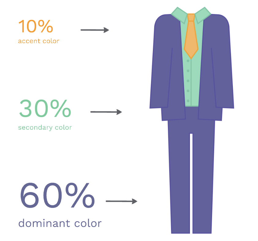
60-30-10 rule
60-30-10 is a principle of decorating that helps balance a color scheme in a space. Most of the time, you’ll want to use this rule in your designs. Choose a dominant color that will take up about 60% of your design, a secondary color for about 30%, and an accent color for the final 10%. These proportions give your designs a nice put-together look. For example, see how the 60-30-10 rule applies to a suit and tie:
In part 1 of the design series, we showed you how to choose color combinations based on the color wheel. The 60-30-10 rule helps you apply that color combination to your design.
If you liked the tips in this article, check out part 2 of our guide to using color to find more tips and visual examples.