When it comes to conveying information, visuals are simply more engaging than words. That’s because our brains are hardwired to process visual information significantly faster than text.
Take, for example, this road sign:

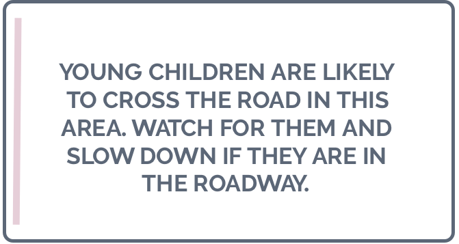
It’s clear and easy to understand. Now, imagine if the sign looked more like this:

The human brain can process that first sign in ¼ of a second. By comparison, it takes an average of 6 seconds to read the 20-25 words in the second sign.
The power of visuals
While the text-heavy road sign is not something you’d see while driving, we encounter the equivalent every day at work or in the classroom. Too many presentations are crammed with rows upon rows of bullet points, leaving people struggling to stay focused and engaged (or even awake).
Because it takes so much longer for our brains to process text, it’s impossible for us to both read and listen at the same time. When someone presents with a slide full of text behind them, we’re actually constantly switching our attention from listening to the speaker to reading the slide and back again. This leads to critical gaps in the information being retained, and people end up either tuning out or making mistakes.
Prezi provides all the tools you need to make your presentations more visual, so that you can create content that complements your presentation instead of hijacking it. Start with a background image that supports your overall message with a visual metaphor. Then, select the right icons and images to cut down on the amount of text.
Tying it all together
Images and icons by themselves are not enough to make your presentation memorable and engaging, though. The true power of Prezi lies in its ability to illustrate the relationships between concepts.
To understand how this works, first picture your kitchen. Now, think of the 5 appliances or tools you use the most.

Chances are you did a mental “tour” of your kitchen and saw the exact spots those objects currently occupy instead of visualizing a bulleted list of items – this is because we tend to recall things more vividly when we map out their relationships to one another.
In Prezi, you’re able to zoom, pan, and reveal to move between pieces of information without ever losing sight of the big picture. This leads to a more memorable presentation, and when presentations are more memorable, they’re also more engaging, persuasive, and effective.
Don’t hand out your information like flyers (which your audience will just immediately throw away). Instead, give them a visual tour of your content that they’ll actually remember with Prezi.
