Knowing all about the importance of visual storytelling in business is one thing, but actually practicing it is another. For presentations in particular, the approach is such a far cry from the structure of tables and bullet points that it all too often comes across as overwhelming or confusing.
In order to help clarify the process, we recently had the pleasure of working on a webinar with presentation design experts Alison Macondray and Matt Clark of Alimat Inc. If you missed it, not to worry. We pulled the top questions from the session and asked Alison and Matt to re-answer them for you below.
For the beginners out there, what are the very first steps to creating a presentation? (BEFORE even opening up the presentation platform of choice)
Great question. We always start with a high-level outline in Word; sometimes post-its that we move around on the wall, which we then port over to an outline. It’s like building a house: You need to know how it’s structured (foundation, floor plan) before planning how it feels (design finishes, color scheme, textures).
Begin with the end in mind. When your audience leaves your presentation, what do you want them to know or believe? What action do you want them to take?
Then, plot your structure. Effective presentations always have a few key elements:
- Opening: Start with a question, story, or stat to hook your audience. Big tip: Make one of the first words out of your mouth “you” not “I.” The audience wants to know what’s in it for them!
- Hook: What’s your main point? Your big idea? Try to boil it down to one sentence. State it near the beginning to create intrigue, then seed it throughout.
- Roadmap: Tell the audience where you’re going. “In the next XX minutes, we’re going to cover Y.”
- Middle: A good rule of thumb is three major sections, even if you have sub-sections within each. What key points, stories, and data will lead your audience from awareness to activation? Create variety throughout: Vary emotional highs with lows, stats with stories, still photos with text and video. This sustains interest and reinforces learning.
- End: It’s very important to end on a high note. What’s your summary? What’s your “ask” or your call to action? Be specific and invite your audience to participate. By now they should be excited enough to want to know what’s next.
Solid structure is a nuanced craft, and worth the research! Two great books on presentation structure and story arc are As We Speak: How to Make Your Point and Have It Stick, by Peter Meyers and Shann Nix, and Resonate: Present Visual Stories that Transform Audiences by Nancy Duarte.
In our work, once we have a solid outline, we flesh out talking points. Only then do we build the visuals – the slides – bringing those talking points to life.
A live presentation is what you say: both verbal and visual. Clarifying what you say in writing will help inform the visuals.
While building out your visuals, refer back to the six tips we outlined in our webinar. Make each slide work for you, supplementing vs. simply mirroring your talking points.
Many people in the business world must adhere to their company’s brand guidelines and templates. What suggestions do you have for creatively working inside those constraints?
Ah, templates. We try to convince clients to bust out of the template as much as possible within their culture. Sometimes it depends on the context. If you’re giving a sales presentation or big-stage talk and the audience knows who you are, do you really need a footer on every slide with your logo? If not, nix it.
Sometimes consistency is good. You know your fonts and colors, and the templates are set. This gives you the opportunity to think not so much about design as about story.
Consider newspapers and magazines. The New York Times and Rolling Stone have the same template month after month. So what makes each issue different? What makes readers come back? They add engagement through a really catchy headline, or a really dramatic photo.
Within a template, your spice and creativity come from your content. The stories you tell, the language you use, and the imagery you choose. Look at how simple you can make your bullets. How surprising or metaphorical you can make your imagery. How catchy you can make the headlines. Interest can also come from shocking stats or other data.
Try to shake things up a little bit. Even in a more reserved culture, remember everyone is still human! Our friend David Nihill, founder of FunnyBiz, analyzed some of the most-viewed TED talks of all time. Each of them has a laugh-per-minute rate that rivals the funniest movies of all time. Give your audience a bit of levity.
DIY is tough. Efforts can sometimes lead to a presentation that looks either too boring or too cartoonish. How do you find a balance?
Keep it simple. Use big, full-frame images and keep text to a minimum. In terms of composition, try to limit the elements on the page to between 3 and 5. Sometimes just a big headline is enough.
If you’re tempted to fill the page with data, really think about the idea you’re trying to convey with that particular slide. Is it an emotional message? Use a big emotional image. Is it data driven? Use a simple chart that has some visual element to it, beyond just the numbers.
If you’re going DIY, invest in resources to give you grounding in innate principles. Some good places to start are Duarte Design’s online courses, Prezi’s tutorials (of course!), and Garr Reynold’s Presentation Zen.
When it comes to creating charts and graphs, what beginner programs do you suggest?
Telling the right data story can be incredibly powerful.
Keynote, PowerPoint, and Prezi give you ways to create data from spreadsheets. Sometimes that’s perfect: A pie chart does the trick. But always question the need.
Sometimes, the exact numbers aren’t super critical, and the more important point is the story. For example, here’s how we told the data story “we’re exponentially bigger than we were a year ago” in the webinar:

A simple icon illustrates the smaller stat, followed by the icon shown large to illustrate growth. That tells the story visually, without having to “do the math.”
A good rule of thumb: If you can tell the story simply, with less information, that’s often a better way to go.

Another example above: At tech client had a bunch of data lending credence to a security threat. Instead of putting a tsunami of data on the slide, we placed two bold statistics over a full-bleed photo of storm clouds, a metaphor for threat.
Images are the backbone of visual presentations, so where can I get some that don’t look too stock but are of good quality?
One of the problems with stock is that it often looks like stock. But it’s actually possible to find stock that looks fresh and illustrates the story well! We typically sort through dozens, sometimes hundreds, of stock images to get the right one.
Images that are overly posed or feature subjects looking straight at the camera look a little less natural. For example, in our webinar, we did a search for “healthy seniors” to illustrate a key slide in our health-services sales pitch.

The one in the second row above is an example of an overly posed image. We chose the image in the bottom row of the couple enjoying each other’s company to signify partnership. Though she’s looking at the camera, their vibe feels comfortable and not staged.

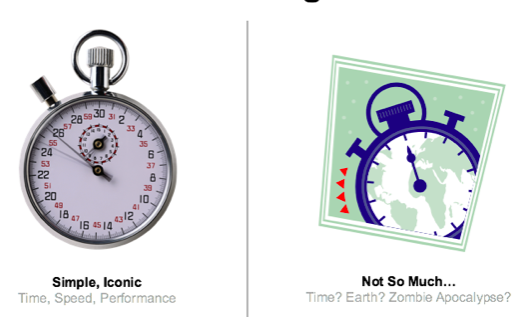
These images above are from PowerPoint’s “clip art” files. The one on the left works pretty quickly — not a lot of interpretation is needed, and the style is less distracting because it’s simple and iconic. The other one is harder to lay a story over because it’s trying to say too many things visually.
Personal or original imagery is always best. Try not to be too specific or literal with images that illustrate a story or a concept. Think of them more as a mood, or a backdrop. They shouldn’t compete with what you are saying.
There are a lot of great options for stock imagery from inexpensive to more significant investments. Here’s a short list:
Single images, Subscriptions and Packages
- Shutterstock.com: $-$$
- Istock.com: $-$$$
- Dissolve.com: $-$$$
- Stock.adobe.com $$-$$$
- Gettyimages.com: $$$-$$$$
Getty images is the biggest, but it’s spendy ($50 – $1,000+ per) and the licensing gets pretty complex. iStock and Shutterstock are more liberal in the royalty free area and very affordable ($10 to $20 per image). All these services also have categories for artwork, icons and illustrations – not just photography.
There are free sources as well. Here’s a short list:
Free with Attribution
- Search.creativecommons.org
- Commons.wickimedia.org
- Flickr.com/commons
Creative Commons is a way for artists, photographers or illustrators to license their work for free. Be sure to read the fine print: Some say you can’t use it commercially, some insist on specific attribution wording. (All NASA images, incidentally, are public domain.)
Image resolution is critical if you want to convey quality and professionalism. If going with Google, you can do the initial search, click on the “gear” icon for advanced search, and search for only “large” images, to access the highest resolution. Just be sure there are no copyright restrictions on images you grab online, or find out the original author and get permission.
Often, the person who designs the presentation is not the person who will actually be giving it. Do you have any advice for making the process as seamless as possible? (Particularly, how do you convince a presenter that they don’t need to squeeze 10 lbs of copy into a 5 lb bag.)
This issue is common in cross-functional companies, where the design team is a service-center to multiple departments. Your world is similar to ours as design consultants.
Start with the mindset: Your job is not to convince them to let you do “your” job – but to make their job easier.
To accomplish this, frame any argument from their world. If possible, meet with the presenter (or the team lead) and ask: “should this presentation succeed beyond your wildest dreams, how will you know?” What’s at stake? What result do they want? If it’s sales, what’s the ideal outcome? What will it mean for their division’s performance, for their career?
If the person on the front line feels involved in the solution, you’re going to be able to craft something that speaks to their needs, and that has their buy-in from the outset.
Here are some arguments that may persuade your cross-functional compadres:
Brevity and Simplicity Create Confidence.
Many presenters think a tsunami of information will convince the prospect. But actually the opposite is true. Simplicity gives the audience space – mental, cognitive space to focus on your core ideas. The complexity can come out in your talking points.
Stats show that the average professional checks his/her smartphone 150 times per day, and spends 28 hours on email. Joseph McCormack details this phenomenon in
Brief: Make a Bigger Impact by Saying Less. Give these busy people less to focus on. They will thank you! And, they will better remember what you say. They will associate you with clarity and brevity.
Conversations Drive Sales.
Persuasion is about relationships. Relationships are forged through conversation – you speaking directly to your audience, and them listening to you.
Great presentations create interactivity and dynamism between the presenter and presentees. If there’s too much on the slide, the deck becomes a separation between you and the audience. (Especially if you find yourself turning away from the audience and reading the slides!)
Slide should exist as a jumping-off point for the words that come out of your mouth. For example: Let’s say you have a bunch of stats to impart. Don’t put them all on the slide! Put your one key stat up – ideally, 3 max – and speak to the rest. Slides are placeholders for what you want them to remember. They’re where you reach the audience’s emotions (evocative images paired with resonant stories) and enter their visual-processing centers.
If you tell a story, put a single iconic image or photo on the slide. Then tell your story. Look your audience in the eye, make them laugh, ask for questions. They will feel seen and heard … and that emotion will reinforce you as someone they trust and from whom they want to buy.
Honing your story is like packing for a round-the-world trip: Take what you’ve packed, and then cut it by half. Truly – that’s all you’ll need. Do a first draft. Then ask yourself: What can be moved to the talking points? What’s really important here? What do I want them to remember?
This discipline will force choices. It will also create space for the unforeseen – including spontaneous live interactions that help make the sale!
Want to learn even more about the design principles that Alison and Matt laid out during their webinar? You can take a look at the webinar recap and recording here. Or, head over to their Visual Story bonus page, which is full of real-life examples of presentations they’ve created that illustrate some of the concepts they discuss above. They also offer a list of additional resources from their favorite storytelling colleagues and gurus.
