As a Principal at York Howell & Guymon, David York spends his days helping people manage their estates and financial assets. When he decided to give a talk on wealth and inheritance at TEDxSaltLakeCity, he knew that he would have his work cut out for him. David had a very specific goal in mind for taking the stage: he wanted to change people’s understanding of what it means to be wealthy.
David knew that he was going to have to develop a presentation that helped him connect emotionally with his audience and tell a compelling story if he was going to change their minds on wealth. And so, he turned to Luke Goetting of Puffingston, a presentation consultancy and official Prezi Expert, to help him develop a dynamic visual aid for his talk. Together, David and Luke developed a prezi that not only got David’s message across but also took his audience on a memorable and engaging visual journey. We spoke with David and Luke to learn more about their process for creating a presentation worthy of the TEDx stage. Take a look at David’s prezi below, and keep reading to hear what he had to say:
How did you approach developing a presentation for TEDx?
David: TED talks tend to be very technology-, education-, and science-driven, so when I initially came to the TEDx organizers wanting to talk about wealth, there were some people on the committee who were reluctant to let me speak. I was able to win them over because I told a story—and used Prezi to visualize that story in a way that really captured the essence of what I was trying to communicate.
How did you determine which stories you were going to tell?
D: When we hear the word “wealth,” we are predisposed to think in terms of money—but in fact, wealth is so much more than that. I wanted to turn this preconception on its head, so I tried to find stories that would do exactly that.
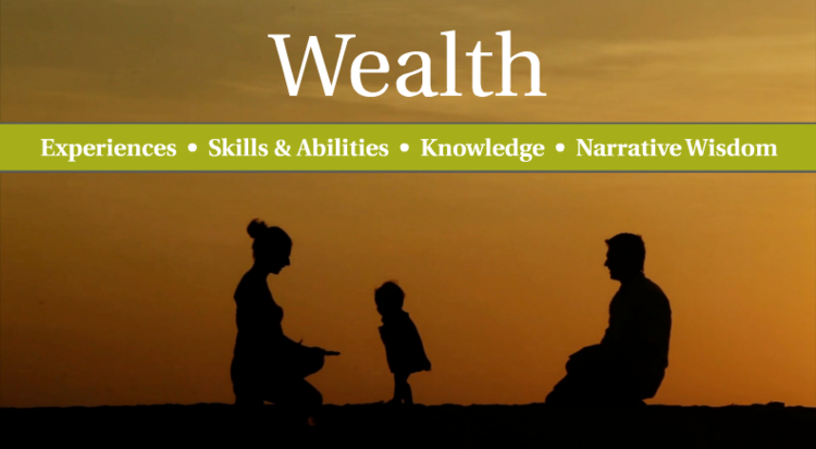
One of the most compelling elements of the presentation came when I switched to talking about wealth in more holistic terms. Luke put together a video that showed a child walking from father to mother, and when I presented it, the audience was transfixed. They weren’t just seeing the idea of wealth transfer—they were experiencing it. I could feel my audience connecting with the idea. I think that if I had simply displayed the words “experience” and “education” on the screen, it wouldn’t have been nearly as impactful.

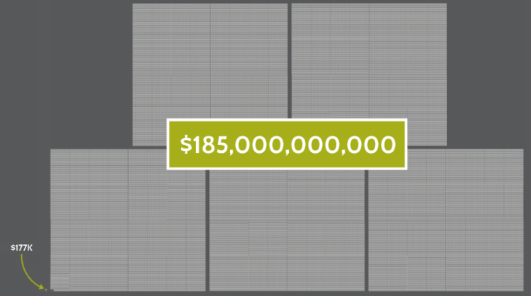
Another great storytelling moment happened when we illustrated the magnitude of a million and a billion. When we hear those terms, we lose perspective. When I was talking about what an average inheritance looks like compared to the Vanderbilt inheritance, we used a two-step zoom-out in the prezi that blew people away. Showing what 185 billion looks like in a visual sense was incredibly memorable for the audience—many people came up to me and commented on it after the talk.

For both you and Luke, once you decided upon these stories that you wanted to tell, how did you go about translating them into compelling visuals?
Luke: David and I agreed from the beginning that we wanted to create an emotional connection with the audience. David’s script injected a lot of compelling stories into the conversation, so it made sense that we wouldn’t simply rely on charts and figures to illustrate his ideas but actually relate them back to the real world, visually.
What was the collaborative process like in working together on the presentation design?
D: Luke and I had a few conversations, and then I sent him the script. I told him that I would know it when I saw it, in terms of the visuals. He took my outline and ran with it, creating an initial structure to which we added elements. The way we set up the Prezi transitions within this structure really helped me take my audience on a journey.
L: David was approaching this topic after writing a book about it, so he had a narrative that was already well-developed. A lot of the time, people will put together a presentation that’s just a collection of information, and they will throw slides together somewhat at random. This kind of presentation tends to have a negative impact on its audience, because there isn’t a structure that ties it all together. The fact that David already had an established narrative made my job as the designer simpler, in a way—I had to make sure that his story translated onto the screen.
Has your TEDx presentation had any impact on the reception of your book?
D: It has been really beneficial for us, yes. Our book is much more readily received because of the TEDx talk and the prezi—they’re a great introduction into the deeper discussion.
With my talk, I really wanted to take people on a journey, where they think “A” when I introduce the topic, but think “Z” by the time I’m finished speaking. If you’re going to take somebody from what they think now to a new line of thinking, you need to go beyond the facts and appeal to people emotionally. The mix of powerful visuals with a good story makes all the difference when you’re trying to do this.
In terms of your delivery, were you doing anything differently from say delivering a slide-based presentation?
D: Luke used icons instead of words to convey the ideas that I was talking about, which was helpful for me as a presenter. While this tactic meant that I needed to remember which icons stood for which ideas, it also prevented me from reading off of my presentation. Nobody in the audience was reading from my visual aid, either, while I was talking—the presentation complemented what I had to say, rather than competing with it.
How did your audience respond?
D: I had people give me feedback afterwards that they had never considered themselves rich, because they weren’t left any inheritance, but that now they see that their families provided them with so much more wealth than they had ever imagined. That was very gratifying.
I also had several people ask, “What program was that and how did you do that?” Several people told me that they want to start using it, because it was night-and-day different from anything they’d ever seen before.
I highly recommend Prezi for any time you’re trying to change a paradigm and need to take people on a journey. For my purposes, it fit like a glove.
