When you’re putting together a presentation, the background you select is key in setting the mood and making sure your content shines. While there are many different good presentation backgrounds that are bright and colorful, there’s a rising preference for simple presentation backgrounds. These clean designs can boost your message by minimizing distractions and making sure your content takes centre stage.

In this article, we’ll delve into the advantages of using simple presentation backgrounds, specific scenarios where they shine, and how platforms like Prezi can elevate your presentations with their open canvas and dynamic tools.
The power of a simple presentation background
Choosing a backdrop for your presentation goes beyond selecting a color or a basic layout. It involves setting up an uncluttered environment that highlights your message effectively. Let’s explore the reasons why opting for a simple presentation background can improve your message.
Improved readability
A key advantage of using a simple presentation background is the readability it offers. Complicated or excessively intricate backgrounds can make the text challenging to read, leading your viewers struggling to comprehend your message. Conversely, a simplistic background guarantees that your text is easily readable, allowing your audience to concentrate on your content.
Reduced distractions
Having a simple presentation background can minimize distractions for your audience, which is crucial when sharing intricate details or holding their attention for a long time. Opting for a simple aesthetic background for presentation slides directs the focus toward the speaker and the content rather than on the background itself.

Versatility
Simple presentation backgrounds offer flexibility. They can be customized to suit various presentation topics. Whether you’re showcasing a business pitch, a school assignment or an imaginative idea, a clean background can serve as the perfect backdrop for your material.
Timeless appeal
Trends in design come and go, but simplicity is timeless. A simple background for presentation slides ensures that your presentation won’t look outdated in a few months. It also conveys professionalism and can be tailored to fit any industry or topic.
What is the best background for a presentation?
When preparing a presentation, it’s best to opt for a background that’s straightforward, neat and doesn’t draw much attention. Opting for colors such as light grey or gentle blue is recommended as they offer a nice contrast with the text. It’s advisable to steer clear of designs or vibrant colors that may overshadow the content.
In case you decide to include images, make sure they’re subtle and relevant to the subject matter. Consistency plays a role here, so stick to the same background style across all slides to maintain a polished and coherent appearance.
Specific use cases for simple presentation backgrounds
Simple presentation backgrounds are suitable for a wide range of scenarios. Here are some specific instances where a minimalistic background works best:
Business presentations
In a corporate setting, professionalism is key. A simple, clean background helps maintain a professional tone and ensures that your data, graphs, and key points are easily readable.

For example, using a soft, neutral-toned background like this empty brown-beige studio room background can create a warm, welcoming atmosphere without distracting from the content.
Educational presentations
When students have to explain ideas, it’s important to keep things clear and straightforward. Using a simple background for presentations can make it easier for the audience to concentrate on the educational points without distractions.

A background with subtle textures, such as this simplistic aerial shot above Lake Dumbleyung, can provide a serene backdrop that doesn’t compete with the information being presented.
Creative and design presentations
When presenting creative work, such as design concepts or artistic projects, the background should complement rather than overshadow the content. A simple presentation background allows your creative elements to take center stage.

Consider using an abstract but subtle design like this abstract lights on a dark green background to add a touch of creativity without overwhelming your visuals.
Personal and inspirational presentations
Personal stories or inspirational talks benefit from backgrounds that evoke emotion without being overly complex. A minimalistic background with a hint of nature, like this colorful clouds at sunset, can create a peaceful and reflective atmosphere.

Product or service showcases
When showcasing a product or service, a simple presentation background can help highlight the subject without competing for attention.

For example, a rendering product background with a clean, neutral design is ideal for presentations focused on product demonstrations, allowing the product itself to be the star of the show. This type of background is especially useful in marketing presentations where the goal is to create a clear and compelling visual representation of the product.
Science and nature-themed presentations
For presentations centered around scientific concepts or natural phenomena, a background that subtly reflects the theme can be very effective.

The soft-focused image of steam provides a simple yet evocative backdrop that can complement discussions on topics such as geology, environmental science, or even metaphorical concepts like transformation and change. This type of background adds depth to your presentation without overwhelming the content.
Youthful and creative presentations
For presentations aimed at younger audiences or those with a creative edge, a playful and vibrant background can help set the tone. This single paper airplane on a yellow background offers a whimsical yet simple design that’s perfect for educational, inspirational, or creative projects.

This type of background is particularly effective in presentations for students, where the goal is to engage and inspire while keeping the design straightforward and accessible.
Technology and innovation presentations
For presentations focused on technology, innovation, or data-driven topics, a background that subtly suggests complexity while remaining visually clean can be very effective.

This abstract background with dots is an excellent choice for such presentations. The modern and sleek design, suggests connections to networks, systems and digital technology. This makes it ideal for discussing AI, networking, or futuristic advancements. The background brings a contemporary tech vibe to your presentation while keeping things simple and clear, ensuring your message stays prominent.
Leveraging Prezi for dynamic presentations
Prezi is a tool that distinguishes itself from slide-based presentations by providing a flexible canvas method. This special feature enables you to craft engaging presentations where the background contributes significantly to shaping the story.
Open canvas for creative freedom
Unlike traditional presentations where each slide is a separate entity, Prezi allows you to work with an open canvas. This means the background isn’t merely a fixed element but an essential component of the narrative. You have the freedom to navigate the canvas crafting a cohesive storytelling journey.
Dynamic panning and zooming for engaging storytelling
One remarkable aspect of Prezi is its panning and zooming feature. In contrast to slide-based presentations, where transitions occur from one slide to another, Prezi allows for navigation across the canvas. You can zoom in on details, and then pan out to reveal the broader context, transforming your presentation into an engaging storytelling experience. This interactive journey lets you evolve the background as you lead your audience through layers of information. The panning and zooming effects not only enhance appeal but also highlight important points and foster a more immersive experience for your viewers.
Simple presentation backgrounds in Prezi templates
Prezi offers a variety of templates that incorporate simple presentation backgrounds, making it easy to get started with a minimalistic design. For instance, the Modular Dark AI-Assisted template uses a sleek, dark background that’s perfect for professional and technical presentations.
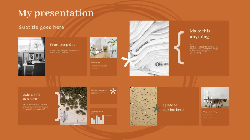
The Research Project Light template offers a clean, light background that’s ideal for academic and educational presentations.

Experimenting with backgrounds
With Prezi, you’re not limited to the backgrounds provided within the platform. You can experiment with your own images to create a unique and personalized presentation. The limitless canvas allows you to place and move elements in a way that’s visually appealing and tailored to your specific needs.
Professional and medical presentations
For presentations in the healthcare industry or any professional field where clarity and precision are paramount, Prezi offers templates like the Medicine Light.
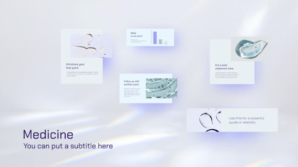
This template features a clean, minimalistic background that reflects the seriousness and professionalism required in medical presentations. The light background ensures that important medical data, charts, and images are presented clearly, making it easier for the audience to focus on the critical information being conveyed.
Effective onboarding and training
When creating onboarding presentations or training sessions, it’s important to use a background that’s both engaging and non-distracting. Prezi’s Employee Onboarding AI-Assisted template is designed to facilitate effective learning by combining a simple presentation background with interactive elements.
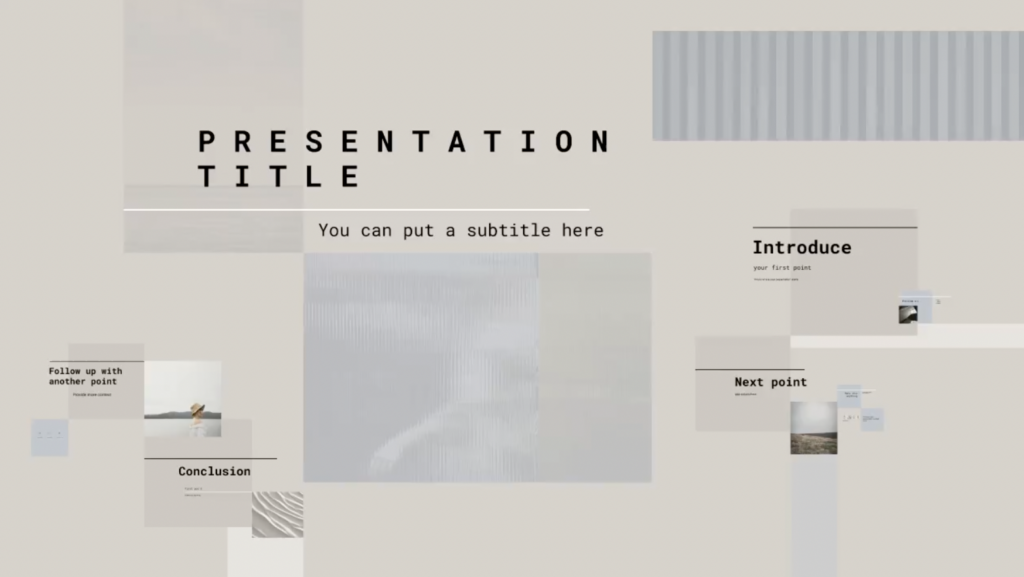
The minimalistic design helps keep the focus on the training content, making it easier for new employees to absorb the information without being overwhelmed by visual clutter.
Educational and lesson plan presentations
Educators looking to present lesson plans or educational content will benefit from Prezi’s Lesson Plan Template.
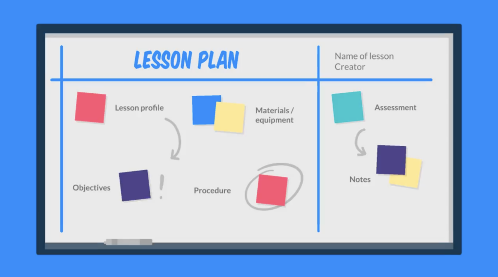
This template uses a simple background for presentations for students that’s ideal for structuring and organizing educational material. The simplicity of the background allows teachers to present information clearly, ensuring that students can easily follow along with the lesson. The open canvas format also enables educators to create dynamic and interactive presentations that can adapt to various teaching styles.
Free backgrounds in Prezi
Another key benefit of using Prezi is its variety of backgrounds accessible directly in the editor, saving you the hassle of hunting for the ideal background elsewhere. Whether you need a work desk setting for a professional presentation or a constellation-themed background for a creative project, Prezi has you covered.
Explore all available Prezi templates and get started!
Embrace the benefits of simplicity in your next presentation
Simplicity is not just a passing fad; it’s evolved into an essential element in presentation design. A simple presentation background improves readability, reduces distractions, and provides an enduring charm. Whether you’re giving a business pitch, teaching a class, or showcasing your creativity, opting for a simple presentation background ensures that your message remains the focal point.
Prezi’s open canvas approach takes this a step further by allowing you to integrate simple presentation backgrounds into a dynamic, visually engaging story. With Prezi, you have the freedom to experiment with creativity, using backgrounds as an essential element of your storytelling. So next time you’re preparing a presentation, consider the power of simplicity and explore the endless possibilities that a simple presentation background, especially in Prezi, can offer.
Remember, you don’t need to look far for the perfect background – with Prezi, a world of simple yet effective backgrounds is right at your fingertips.
Looking for more background ideas? Find good presentation backgrounds here.
