Chelsi Nakano
May 15, 2017
The best fonts for presentations convey more meaning, kick up your brand’s personality, and bring words to life. That said, it’s important to make sure your audience isn’t spending all of their energy focused on the text on the screen. Use our tips below to discover the best fonts for your presentation to keep it balanced.
How to choose the best font for a presentation
Serif vs. sans serif
Serif fonts use decorative lines on the ends of letters, while sans serif fonts don’t. Serif fonts can be more legible in smaller font sizes, as the little lines help readers distinguish letters and follow some sort of flow as they read. Sans serif fonts work well in tight spaces, like labels and headings, and can be more legible from far away or in poor resolutions.

Readability
When choosing a font, go for something that’s easy to read. Decorative fonts are fun, but can be so distracting they take away from your message. Presentations work best with a sans serif font (they’re more legible), especially if they’re being read from far away. A few extra pointers:
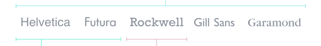
- Helvetica and Futura are legible at most font sizes.
- Rockwell is bold, suitable for a headline or point you want to hammer home to your audience.
- Classic styles such as Helvetica, Futura, Rockwell, Gill Sans, and Garamond are some of the best options for body copy in presentations.
How many fonts should you use in a presentation?
It’s best to limit the number of fonts in your presentation to create a more cohesive product. Try using up to 2 fonts, one for headings and one for body copy. The font for your body copy should be easy to read in large blocks of text, while your heading font should be larger and legible from further away (especially if you’re presenting to a large audience in person).
Standard fonts
You wouldn’t want your presentation to look different on someone else’s device, so you should choose a font that comes standard on the majority of operating systems. Prezi uses Google Fonts, a catalog of free, open-source fonts that are available for commercial use.
Tips for using presentation fonts effectively
Text placement
When you add text to your presentations, take care to make sure it’s big enough to read, but doesn’t steal the show; informative, but not dense; and placed with intention rather than just slapped up there any old way.
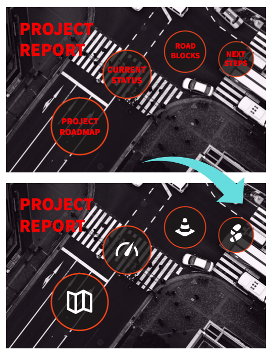
Labeling your topics in Prezi
When it comes to labeling your topics in Prezi, short titles are best because they’re easier for viewers to digest and help presenters get to where they’re going quickly. You can even replace your labels with shapes or illustrations if they are clearly representative enough of each topic:
Bullet points
Keep in mind that bullet points may seem audience-friendly, but they can be distracting (think of where your eyes zoom to when you skim an article). Keep the attention on you. Instead of several points per frame, try to focus on displaying a single message at a time. And remember, a visual representation that supports your point is more effective at conveying the message than more text.At the end of the day good typography isn’t that hard to master. Just ask yourself if you were attending this presentation, would you get the message? When you’re ready to dive into more of the basics, like choosing right colors and organizing content, fill out the form below to download our eBook: “Presentation Design 101 for Sales and Marketing.”
