Nicole Cooper
July 12, 2016
Puffingston CEO and Prezi expert Luke Goetting recently ran a webinar with us, explaining how to transform ineffective business presentations into dynamic prezis. Luke and his team regularly take their clients’ existing slide decks, chock-full of traditional charts and graphs, and transform them into zestful prezis. In this post, we are going to dive a bit deeper into his examples of real life “before” and “after” presentation transformations. Take a look to get some inspiration for your next presentation redesign.
If you missed the webinar, here is a link of the full recording that Luke put on for us.
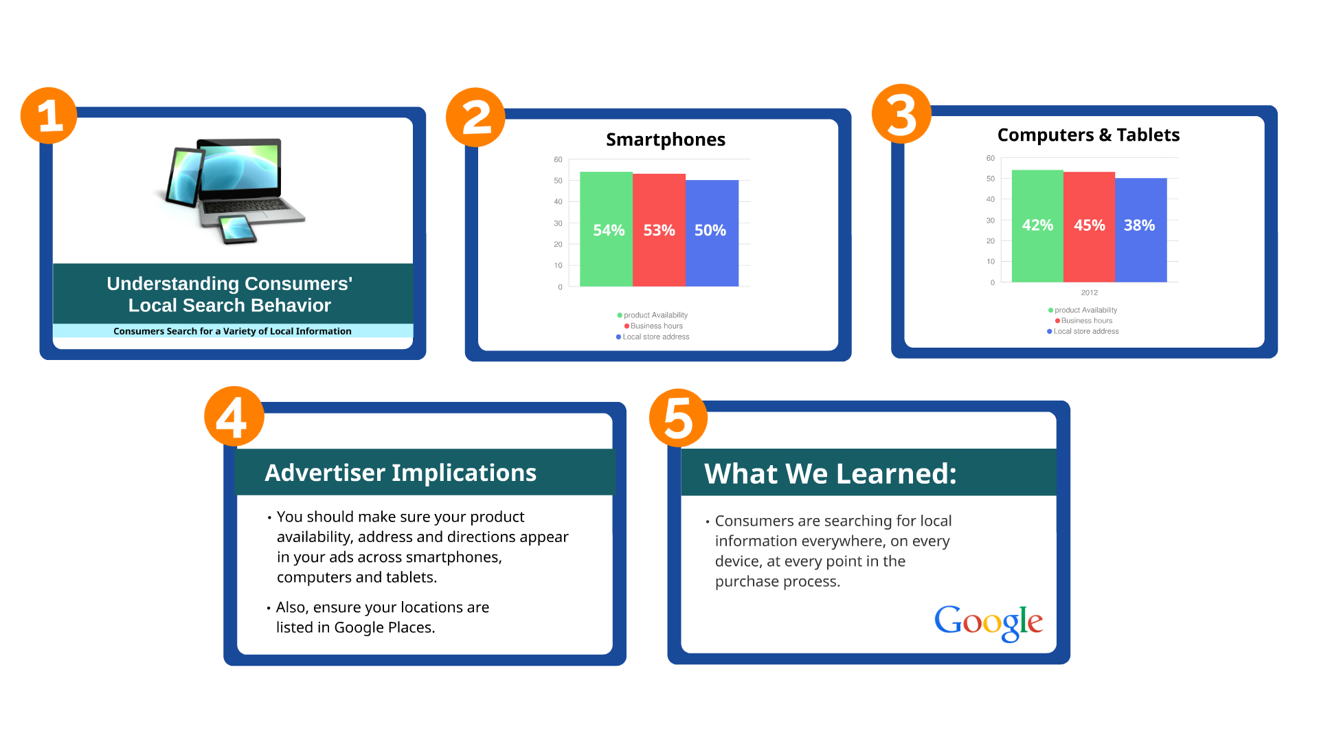
Use visuals.
Before:

Visuals are not only meant to simplify information but to also capture the audience’s attention; however, this example is neither eye-catching nor captivating. There’s nothing creative about a bullet-pointed list, and without showing a hierarchy of information, the audience is bound to become disinterested and leave without takeaways.
After:
In order to make the information come to life, Luke transformed this slide from a boring list into a graphic. Instead of this slide being difficult to read, Luke introduced light colors that are cohesive and easy on the eye. Not only is this easier to understand and more memorable, but it is fully engaging the viewer to imagine the data visually.
Structure meaningfully.
Before:

The ideas you want to highlight in your presentation won’t come across if they are listed as an honorable mentions reel. In this example, the Agenda slide shows what the presenter will cover in a dull manner and doesn’t allow you to visualize what those topics are all about. The linear presentation that follows provides no visual structure and confuses the audience within the content flow; as a consequence, the audience can get easily lost.
After:
Having a meaningful structure helps the audience understand where they are in the presentation. In this prezi, Luke positions the content to show the level of importance and elaborates by zooming into subcategories. Structuring a presentation with subtopics should be in a meaningful order that follows a chronological path as the presentation progresses. As a result, the takeaways of each section are displayed in plain view for the audience—referring back to information in case they get lost.
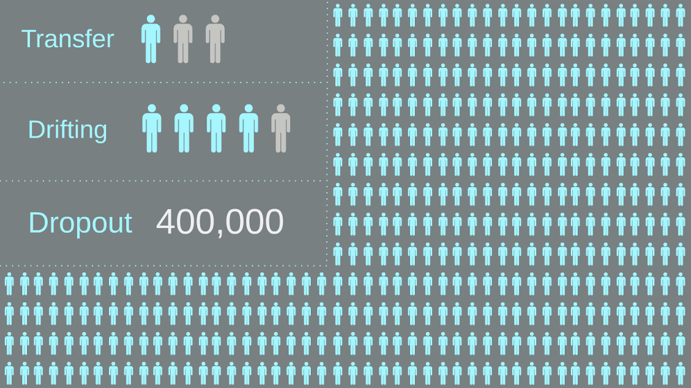
Make it flow.
Before:
In this example, the slides are disconnected from the data, making it less involved and more complicated. The information in this presentation could be much more compelling if the audience could see it as a whole instead of just as individual, isolated data points.
After:
Here Luke’s team used Prezi’s zooming and panning capabilities to draw connections between different pieces of data and show how all of this information is related. Before the presentation continues, small data sets serve as background knowledge for what will be mentioned ahead. The concepts flow into a synopsis of information that engages the user to follow one frame to the next.