It’s no secret that humans are drawn to visual stimuli, but many underestimate how colors affect our emotions and responses to information. Our color associations are not merely preferences, they’re also influenced by culture and evolution. For instance, it’s thought that humans have an aversion to brown because of its associations with rotting produce. However, the color red captures our attention because it’s a universal sign of heightened emotion. Presentations that are not only visual but also thoughtful when it comes to color, have a better chance of effectively communicating their message. That’s why in this article, we’ll share some of our top tips for putting together a powerful presentation color palette.

Presentation colors: Setting the mood
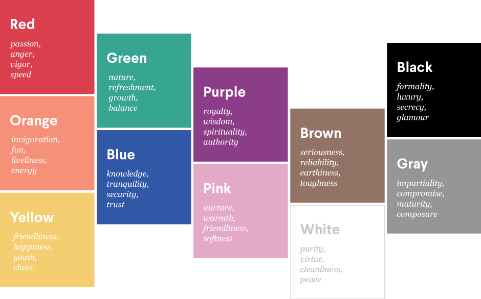
To choose your presentation colors, start by determining what mood you’re trying to set. Is the message supposed to be exciting? Perhaps it’s intended to keep people calm during a time of high tension, or maybe it’s full of important information that will require your audience to stay alert and attentive throughout. In any case, try using the guide below to help you select the right starting point for your presentation colors.
A dash of color theory
Once you’ve used mood to determine your base color, you can move on to choosing the rest of your presentation colors. At 99designs, we use a color wheel and a bit of color theory to help us out. Consider one of the following themes:
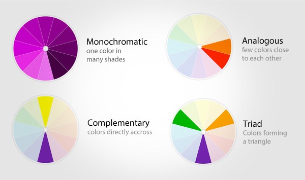
Monochromatic: one color in multiple shades or hues.
A monochromatic theme will give your presentation a feeling of harmony and be visually pleasing to almost everyone. If this were a food, it would be spaghetti with meatballs: it’s a classic and when done right it can be amazing, but even if not done right it’s pretty hard to offend anyone or make it terrible.
Analogous: two colors right next to each other on the color wheel, you’ll want to pick different shades or hues of these colors, as well, for contrast.
This approach adds a nice level of variety but is still fairly safe. This is good for helping people pay attention and take in complicated topics without overwhelming them. If this were a food it would be enchiladas: it has a little spice, but it’s still a pretty safe thing to serve at a dinner party.
Complementary: two colors across from each other on the color wheel, again, with a couple shades/hues of each.
This will get attention! When we see complementary colors next to each other, it overloads our brains. This sort of scheme is best used when you definitely want to make a splash. If this type of theme were a food it would be screaming hot chili: some people are going to love it, but it may be too spicy for others.
Triadic: three colors equally spaced around the color wheel, with small variations in the shade of two colors.
This is a color scheme for advanced color users. When done right, it can guide where people look, creating balanced and visually compelling presentations, but it’s also really easy to mess up. Triadic themes are chocolate souffle: gourmet, delicious, will win you praise from almost anyone, but are super hard to make a right. One tip to keep in mind is to give each of your presentation colors a purpose. For example, one color should be more muted to ground viewers and the other two should be intentionally used as accents.

Tips for choosing the best presentation colors
Choosing the right presentation colors is crucial because they can significantly impact the audience’s perception and understanding of the content. Here are a few tips to help you select the best colors for presentations:
Think about what colors mean
Different colors can make people feel different ways. For example, blue is often seen as trustworthy, and red can grab attention. Choose presentation colors that match what you’re trying to say. If your theme is more on the formal side, blues and greens are great. For something that needs to pack a punch, you might want to go with reds and oranges.
Know your audience
People from different places or backgrounds might see colors differently. And it’s not just about culture; age and gender can play a role too. Younger folks might like bright, bold colors, while a more mature audience might prefer something less flashy.
Simplicity is key
Stick to a few presentation colors so you don’t overwhelm your audience. A good starting point is one main color for the background, another for your text, and maybe one or two extras to highlight important points. This makes sure your audience knows where to look.
Make sure it’s easy to read
You’ll want to pick presentation colors that stand out against each other so everyone can read your text easily. A dark background with light text or the other way around usually works best.
Test it out
Colors can look different depending on where you’re presenting or what device you’re using. Always check how your presentation colors look in the room you’ll be in or on the device you’ll use. This way, you can make sure everything looks just right, no matter where you are.
Brand alignment
When picking colors for your presentation, it’s key to match them with your or your company’s brand. This consistency helps people recognize the brand and keeps things looking sharp. If you’re presenting on behalf of a company, starting with the brand’s colors is a smart move.

Trend awareness
Staying up to date with current color trends can give your presentation a modern and relevant vibe. But remember, it’s crucial that these trendy colors fit well with what you’re trying to say and don’t shift focus away from your main points.
Be aware of accessibility needs
Make sure to consider how accessible your color choices are for people with color vision differences. It’s important to steer clear of color pairs like red-green or blue-purple that might be hard for someone with color blindness to tell apart.
Feedback loop
It’s a smart move to get some outside opinions on your choice of presentation colors. Chatting with colleagues or friends can shine a light on aspects you might not have considered. They might see things differently, which can really help you fine-tune how your presentation comes across.
Keeping these points in mind can help you choose the right presentation colors, making it clear, engaging, and accessible to your audience.

How do colors work?
Colors carry distinct meanings, allowing you to shape audience perception in your presentation. Understanding these meanings helps in choosing the right presentation color palette to achieve the intended impact on your audience.
- Red: Signals urgency and excitement. It’s powerful for grabbing attention and can evoke strong emotions like passion and danger.
- Blue: Conveys trust and calm. It’s preferred for its soothing effect and is often used in corporate and healthcare settings to inspire confidence.
- Yellow: Associated with happiness and energy. Its brightness catches the eye quickly, making it effective for highlighting important points.
- Green: Represents growth and harmony. It’s easy on the eyes and used to denote eco-friendly concepts or financial themes.
- Orange: Suggests creativity and enthusiasm. It’s less aggressive than red but still effective in drawing attention and showing warmth.
- Purple: Implies luxury and wisdom. It’s used to create a sense of mystery or to appeal to the imagination.
- Black: Denotes sophistication and elegance. It’s powerful for conveying seriousness and can make other colors stand out when used as a background.
- White: Symbolizes purity and simplicity. It’s great for creating contrast and making content appear cleaner and more accessible.
- Pink: Evokes femininity and romance. It’s softer than red and can attract attention with its nurturing and calming qualities.
- Gray: Represents neutrality and balance. It’s versatile, often used as a background to help other colors pop or to convey a sense of sophistication without overwhelming.

What colors attract people’s attention?
When selecting colors for presentations, our primary goal is to capture the audience’s attention. This requires a thoughtful selection of colors that complement each other well. Here are several attention-grabbing color combinations designed to catch the eye, tailored to suit many themes and styles:
- Red and white: This mix is great for when you want to get people excited or to act on something, like in a sales pitch or a pep talk. It’s clear and direct.
- Navy blue and gold: Perfect presentation colors for serious business talks, financial updates, or anything where you want to look sharp and trustworthy. The use of a blue color theme keeps things looking professional.
- Yellow and gray: This combination is perfect for sparking creativity or presenting something new, like a startup idea or a design project. It’s bright and keeps things interesting.
- Turquoise and coral: This one’s refreshing and works well for topics on health, wellness, or the environment. It feels fresh and easy on the eyes, great presentation colors for learning settings.
- Purple and lime green: If you’re aiming to stand out, especially with tech or futuristic themes, this is your go-to. These are colors that grab attention without being too much.
- Orange and teal: Ideal for talking about marketing, travel, or anything adventurous. It’s engaging and makes people want to listen, perfect for a younger or dynamic crowd.
- Black and electric blue: When you’re dealing with high-tech or luxury products, this beautiful color combination gives off a cutting-edge vibe. It’s sleek and makes a statement.
Each pair is picked to not just look good but to help convey your message effectively to your audience, depending on what you’re talking about.
Presentation colors: careful application is key
When you’ve got your palette together, remember to use it to direct attention rather than steal the show. For example, see how the monochromatic theme below was applied to the dinosaur illustration. From left to right, the first color was used for headlines, the second for body text, the third for background, and the fourth and fifth are accent colors.

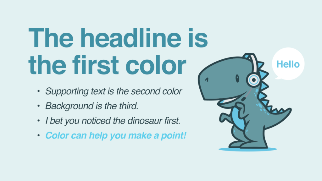
Also, remember that accent colors should be used sparingly. Try using them to draw attention to the most important parts of your presentations, such as the 1-3 key takeaways you want people to remember.
If you’re interested in learning more about creating an effective presentation, read the following article on presentation design.
