Līva Luriņa
October 14, 2021
In the digital age, where first impressions can make or break your brand’s success, selecting the right brand colors has never been more crucial. Whether you’re an app developer aiming to create a serene mindfulness experience or a CrossFit gym looking to inspire strength, your brand colors play a pivotal role in shaping perception and influencing behavior.
People subconsciously judge brands within 90 seconds of interaction, and up to 90% of the time that assessment is based on brand colors alone. For this reason, you should choose the brand colors really thoughtfully.
What exactly are brand colors?
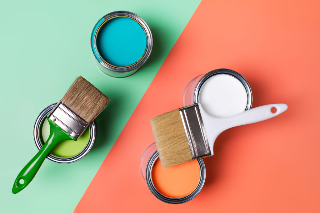
Brand colors are one of the most powerful tools to build brand awareness and associations. There’s a common misconception that branding colors are the ones used in the company’s logo, and everything else can be matched to the platform or use case. But it’s so much more than that.
The color palette you’ve chosen in your brand kit should be consistent with your entire brand infrastructure. You need to align all your visual assets like the homepage, app, product packaging, social media platforms, user manuals, and banners to be styled with the brand colors to create a broad and united brand. Read more about the benefits of branding on our blog.
The power of brand colors
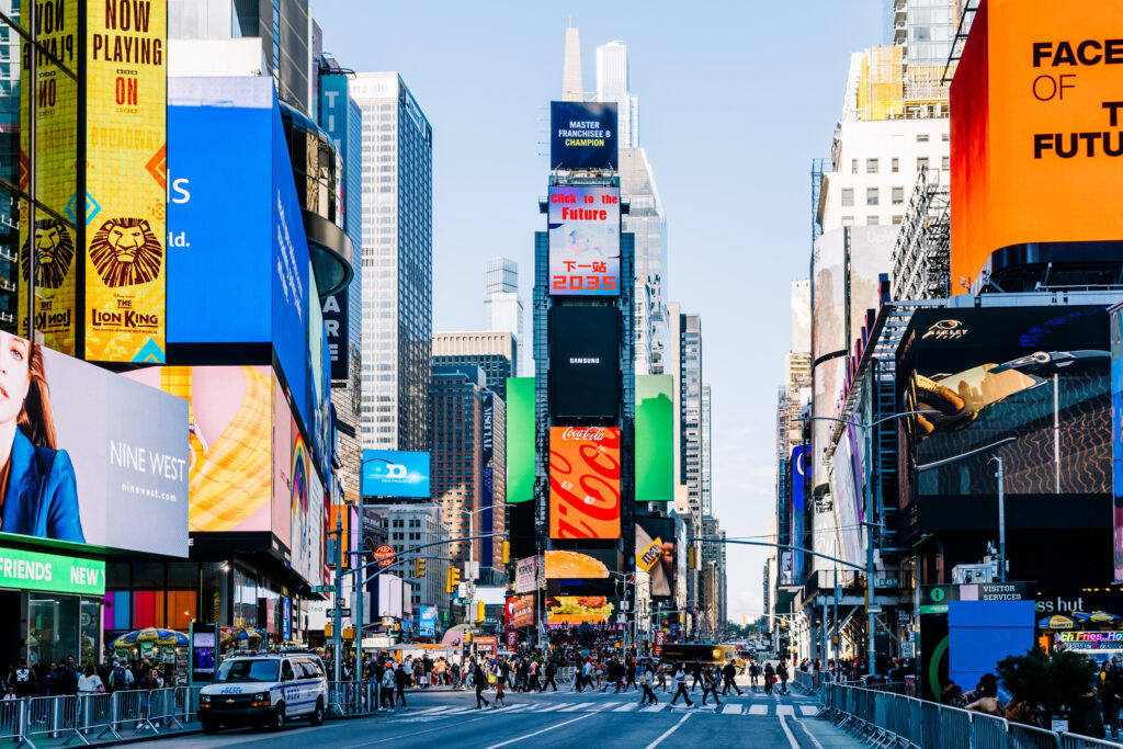
Imagine walking through the aisles of a supermarket. Your eyes land on two brands of chocolate. One is packaged in a vibrant, golden wrapper with bold red text, while the other is in a simple, brown paper package. Your hands might instinctively reach for the golden package, not because you know it tastes better, but because the packaging exudes a sense of luxury and quality. The brand colors have subtly communicated an unspoken promise of a premium experience, nudging your purchasing decision.
Color theory suggests that our perception of colors has the power to affect how we feel. What one person finds elegant, another may find depressing. Additionally, colors are associated with objects and emotions, making their impact subjective. Therefore, when choosing brand colors, it’s imperative to consider these psychological factors.
In a groundbreaking study of neuroscientist Antonio Damasio, he found that even if we believe we’ve made a logical decision, that choice is usually based on emotion.
The psychology of brand colors across industries
Color psychology is a fascinating field that delves into the impact of colors on our emotions and perceptions. As brands aim to connect with their audiences on a deeper level, the choice of brand colors becomes a strategic decision. Here, we’ll explore how various industries select their brand colors and the underlying psychological factors that drive these choices.
Fast food and restaurants
Warm colors like red and orange are popular in the fast-food industry because they’re lively and can make people hungry, prompting speedy dining choices with their energetic vibe.

Technology and finance
Tech and finance often stick with blue brand colors, a color that symbolizes trust and professionalism, aiming to present their brands as dependable and stable.
Healthcare and pharmaceuticals
Healthcare leans towards calming blues and greens, intending to communicate trustworthiness and wellness, helping people feel at ease with their products.
Eco-friendly and organic brands
Eco-brands love green brand colors, as it’s linked with nature and harmony, positioning them as a natural, organic choice for customers.

Luxury and fashion
Luxury brands often select brand colors like black, gold, and purple to communicate a sense of timeless elegance and exclusivity.
Child-centric brands
Brands for kids favor bright and playful colors like red, blue, and yellow, tapping into the lively imagination and creativity of children. LEGO is a good example of a brand that uses bold, fun brand colors to spark children’s curiosity.
Beauty and cosmetics
Beauty brands may pick colors like pink to communicate charm and femininity, aligning with qualities often associated with allure and playfulness.

Tech startups
Unlike blue-loving tech giants, startups often go for bold and lively colors, signaling innovation and a dynamic approach, making them stand out in the crowd.
Automotive industry
Car brands might choose robust reds for a sense of speed and excitement, or sleek silver to convey modernity and sophistication.
Education and nonprofits
Educational and nonprofit entities often lean towards friendly brand colors like light blue or soft greens and pastels, establishing a nurturing and supportive vibe.

The importance of branding colors
Colors trigger different emotions
One of the most prominent scholars in color theory, Faber Birren, spent most of his academic career studying the influence of color. Rather than saying that colors directly influence emotions, he wrote that it’s the human perception of colors that affects our emotions.
That’s why we see and feel about brand colors differently. While one person is excited about the elegant black design, the other finds it depressing and overwhelming.
Scientists have found that our brain associates color with objects we like (e.g., fuchsia with tasty raspberries) or dislike (e.g., teal color with rotten food). In combination with cultural, geographical, or cognitive differences, color perception can be pretty subjective. The conclusion? You should be prudent when you choose your brand colors.
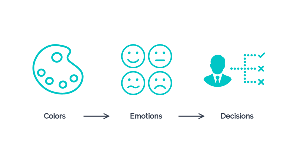
Brand colors play a huge role in decision-making
Once the color triggers your emotions, it will pretty likely affect your decision-making as well. In a groundbreaking study by neuroscientist Antonio Damasio, he found that even if we believe we’ve made a logical decision, that choice is usually based on emotion.
With branding, businesses can create powerful emotional connections with their audience and customers. Imagine yourself walking into a grocery store, trying to pick a product between unknown brands – most likely, the first one to grab your attention would be the one with brand colors and packaging that triggers a desire or interest in your mind.
Strengthening brand awareness
Most importantly, consistently using your brand colors creates a strong association with your product for potential buyers. That’s a huge plus for your brand awareness as a whole.
To better understand this, look at the color palette below.
Can you recognize the brand?

This is the Slack core color palette. The combination of these iconic colors is so consistently used in all of Slack’s assets that most of us create an immediate connection whenever we see them together.
Wrapping up the importance of brand colors – colors create emotions and emotions lead to decisions. If the palette is wisely chosen, brand colors can help get people to take action now or after a few more interactions with your brand – that’s just a matter of time.
How to choose the right brand colors
Here are five tips to help you select brand colors that resonate with your target audience:
Define your brand identity
Take a deep dive into your brand’s essence. Revisit your mission, values, personality, and unique attributes that set you apart from the competition. Consider what story you want your brand to tell. Are you all about innovation and cutting-edge solutions, or perhaps you’re an advocate for sustainability and eco-friendliness?
The brand colors you choose should harmonize with your brand’s core elements. For instance, if your brand exudes creativity and innovation, you might lean towards vibrant, unconventional colors. On the other hand, if your brand embodies trustworthiness and dependability, a more classic and subdued color palette might be the way to go.
Define your audience and their associations
Your brand doesn’t exist in a vacuum; it’s meant to connect with real people. Understand your target audience inside and out. Consider factors like age, gender, location, and cultural preferences.
Dive into their psyche and decipher what makes them tick. How do you want them to perceive your brand, and what emotions can trigger their decision to engage with your products or services? If you’re appealing to a tech-savvy younger crowd, contemporary, bold brand colors might resonate well. If your audience is more mature and values tradition, a sophisticated and timeless color scheme could be more effective.
Explore the meaning of brand colors
Colors are a language of their own, and each hue carries distinct meanings and associations. Delve into color psychology to gain insights into how different brand colors can impact emotions and perceptions.
Here are the most popular brand color meanings in a nutshell.
Red color meaning
Red is for passion, energy, and danger. It’s usually associated with heat, love, and excitement. It’s also commonly used as a brand color to urge action, for example, in CTA buttons on websites or for appetite stimulation, which is why in many fast food restaurants’ logos, you’ll find elements of red.
Orange color meaning
Orange is about creativity, youth, and enthusiasm. It combines the heat of red and the playfulness of yellow. Orange is an excellent choice for youthful and creative brands. Also, you can use it to draw attention to something or promote action.
Yellow color meaning
Yellow spreads happiness, hope, and positivity. It’s commonly linked with joy because it’s the color of smiley faces and the sun. Yellow is the perfect choice to grab attention instantly. However, it is commonly associated with low prices.
Green color meaning
Green stands for nature, growth, harmony, wealth, and stability. It’s a broadly recognized choice of brand color for eco-friendly and organic products, creating a solid connection with nature. Though shades of color matter, neon versions of green will have the opposite effect and bring more artificial and innovative vibes to your brand palette.
Blue color meaning
Blue is about peace, trust, intelligence, and professionalism. No surprise, it’s the most popular color globally, both for personal preferences and brand colors. You can often see it in the logos of IT companies, financial institutions, big corporations, and social media platforms. If you want your brand to be immediately associated with professionalism and trust, blue is a safe choice.
Purple color meaning
Purple is often associated with luxury, mystery, and spirituality. It’s a combination of passionate red and calm blue. To add a sparkle of mysticism and spirituality, you can include shades of purple in your brand color palette.
Pink color meaning
Pink usually represents femininity, playfulness, romance, and sensitivity. It’s one of the least common branding colors, right after brown. We’re still at the phase when pink is associated with products made for women or something sweet and cute. However, if you’re brave enough and see it as a good idea, pink can add some playfulness to the brand color palette and help you stand out in front of others.
Brown color meaning
Brown is a natural color and stands for stability, warmth, honesty, and support. It can also represent practicality, old-fashioned goods, or… chocolate. If your brand represents natural and organic products, brown combined with green could be a good fit.
Black color meaning
Black stands for power, elegance, and sophistication. It’s commonly used in graphic design – black can be bold by itself, add a nice touch to details, or provide a super-powerful combination with any other color (e.g., silver for exclusivity or bright neon for a chic and modern look).
White color meaning
White color spreads simplicity, minimalism, and aesthetics. It’s the most neutral color and can be very useful in your brand color palette for assets like web pages, packaging, or secondary accents. Combining white and pastels will create a soft and mild feeling. White and black – classy minimalism, but with golden elements, it will make a luxurious yet pure design.
Gray color meaning
Gray is a mature, formal, professional color, sometimes feeling a little conservative or conventional. However, different shades of grey are used in web and graphic design as an alternative for black or white. It’s a neutral color that connects well with practically everything, for example, blue for even more professional matches or bright yellow for shocking and eye-catching designs.
Multicolor meaning
Multicolor brand logos are fun, inclusive, optimistic. It’s a fantastic color choice if you want your brand to be associated with openness and diversity.
Explore competitors
While you don’t want to be a copycat, it’s essential to understand the landscape in which your brand operates. Analyze your competitors and their brand colors. Seek out opportunities for differentiation. If your competitors are predominantly using earthy tones, consider introducing a splash of bold and vibrant colors to stand out. Remember, it’s not about being radically different for the sake of it; it’s about carving your unique space in the market while staying true to your brand’s identity.
Create a branding color palette
Of course, one color is not enough to create a branding color palette. But how do you choose the brand colors that look professional and resonate with your target audience?
Here are four common ways to choose the right branding color combination.
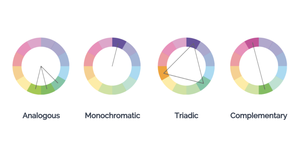
The analogous color palette is a combination of three colors next to each other on the color wheel. They are low-contrast and are typically used for backgrounds and softer designs. Autumn and spring color palettes are good examples of analogous color combinations.
The monochromatic color palette consists of different tints, tones, and shades of one color. These are soft combinations that look great in charts and graphs, creating a clean and polished effect.
The triadic color palette presents a balanced combination of three different colors that form an equilateral triangle on the color wheel. The best way to use triadic color schemes is to choose one color as the main background color and use the other two as accent colors.
The complementary color palette includes two high-contrast colors that are opposite each other on the color wheel. Together these brand colors create a bold effect and are best used when you want something to really stand out.
However, even if you’ve chosen the colors that represent your brand the best and look great together, you still need to apply the best design practices to avoid the most common color mistakes.
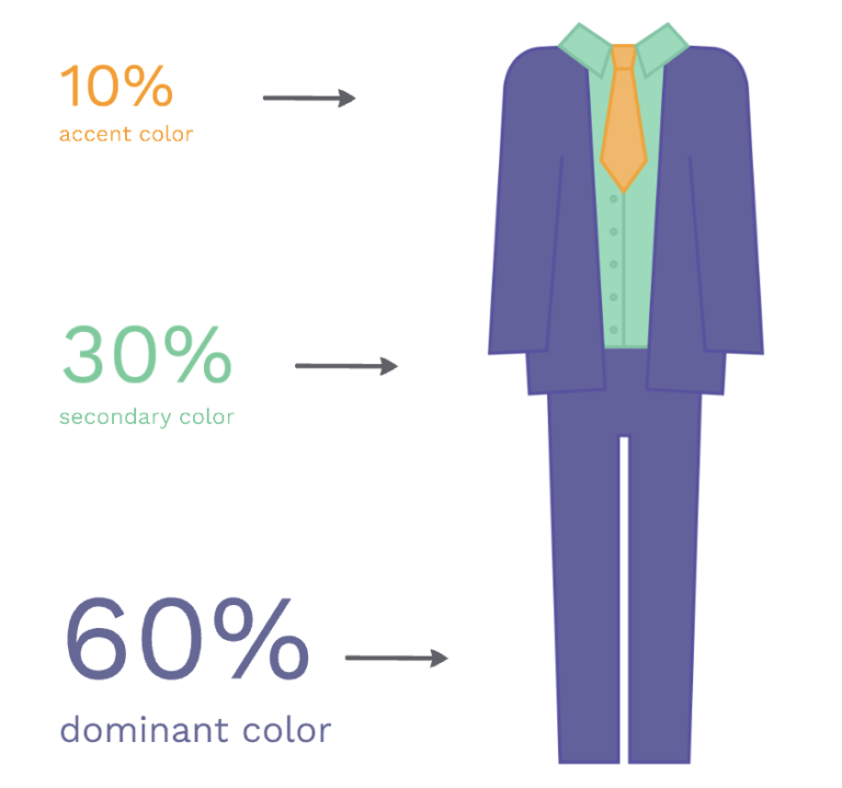
One such example is the 60-30-10 rule for arranging brand colors within your design. This means that when you’ve chosen a brand color palette with 3 colors, try distributing them in your graphics so that a dominant color takes up 60% of your design, a secondary color for about 30%, and an accent color for the final 10%. These proportions will make your design look more polished and complete.
Create brand assets
Presentations, virtual backgrounds for meetings, videos, reports, email banners, and any other external-facing content coming from your company should be on-brand.
The easiest way to bring your brand colors to life is to create a brand kit before starting to make brand assets. When doing so, you’re not only helping yourself but also giving your creator’s team everything they need to keep all the visual materials consistently on brand.
Branded videos, webinars, and virtual meetings
Within Prezi Video, you and your team can quickly create engaging branded video content in minutes. This is perfect for sales pitches, marketing videos, training sessions, company updates, and more. Record on-brand videos to share asynchronously, or present live through the Prezi Video desktop app and your preferred video conferencing tool.
Engaging presentations in your brand colors
Presentations are an important part of everyday work for most of us. And using brand elements in presentations is a must-have, especially, if you’re pitching your brand or product externally. Prezi is your go-to tool to make interactive presentations that not only express your brand identity in the most engaging way possible but also wow your audience, breaking all the assumptions about sales presentations and traditional slides.

Interactive data visualizations and graphics
We recommend your brand asset library includes social media visuals, infographics and reports, posters, charts and graphs, maps, and other visual elements. Whether you’re using these materials internally or externally, preserving the right style and brand colors will make them look professional and compelling.

Increasing brand awareness takes time, but being consistent with your branding colors, voice, style, and other brand assets will help you drive results more effectively.
Fresh and unconventional brand color ideas
Navigating through unconventional branding colors? Here’s how you might mix and match hues to make your brand pop and resonate differently:
Pastel pop
Envision a palette with gentle pastels like lavender and mint, then add a bold neon pink or yellow. Ideal for fun, trendy brands in fashion or beauty, aiming to attract a youthful, lively demographic.

Cosmic fusion
Picture deep cosmic blues and indigos, blended with bright purples and magentas. Perfect for tech or gaming brands, this palette communicates mystery and innovation, inviting users into a world of wonder.

Desert mirage
Mix warm shades like sandy beige and terracotta with cooling turquoise and dusty blue. These branding color schemes evoke adventure and are a great fit for travel or wellness brands that want to connect with nature enthusiasts.

Retro revival
Channel the ’80s and ’90s with bold neons alongside classic black and white. Brands in fashion or entertainment might choose this to tap into nostalgic and edgy vibes.

Steampunk aesthetics
Combine rich brassy tones with deep blues and elegant burgundy and emerald. Ideal for brands portraying vintage craftsmanship, perhaps in artisanal or tech niches.

Urban jungle
Mix gritty urban grays with vibrant greens and yellows. Perfect branding color schemes for promoting eco-conscious urban living or sustainable fashion, blending the essence of city life and sustainability.

Futuristic neon
Imagine a palette with neon blues, greens, and purples, highlighted with metallic silver. Suited for tech startups, this palette shouts innovation and a forward-thinking ethos.

In all, whatever palette you select, be it classic or outside the box, ensure it mirrors your brand and speaks in colors that resonate with your audience’s feelings and likes. Creating a palette that aligns with your brand’s spirit and your audience’s preferences is the goal of every hue you choose.
Simplifying the colorful journey in global branding
Envisioning your global color story
When you’re selecting your brand colors, think big! Your goal might be global recognition, and that means choosing colors that aren’t just memorable, but also connect with people all over the world.
White and red: a tale of two colors
Consider the different stories a color can tell worldwide. In many Western cultures, white might speak of purity and peace, but head East and it often represents mourning. Red, while universally energizing, means luck and joy in China, but could signify mourning in certain African cultures.
How brands paint a global picture through branding colors
So, how do brands find their way through this complex color landscape? It starts with deep research and an understanding of local cultural contexts. This helps craft branding color schemes that not only respect but also resonate with different cultures globally. Moreover, being flexible and slightly tweaking brand colors for different markets might just be the secret to maintaining authenticity and cultural sensitivity.
The craft behind globally appealing brands
Mastering the art and science of color branding in global markets intertwines a brand’s identity with the vibrant cultural intricacies it aims to connect with. It’s about understanding, respecting, and creatively navigating through the various color narratives of global cultures, resulting in a brand masterpiece admired across international stages.
Brands that shine globally
Apple
Apple sticks with silver, black, and white, portraying sleek innovation and sidestepping varied cultural connotations, thus, achieving a consistent brand image globally.
Nike
Nike goes classic with a black-and-white scheme, avoiding potential color pitfalls across cultures while maintaining a universally bold and elegant brand personality.
Tiffany & Co.
The renowned “Tiffany Blue” is not just a color but a global symbol of elegance and timeless luxury. It manages to convey a sense of upscale sophistication without being potentially divisive in different cultural contexts, maintaining a luxurious yet approachable image worldwide. It strikes a delicate balance, offering a universally aspirational yet never isolating brand experience.
The strategic importance of brand colors
In the sphere of branding, colors extend beyond mere visual appeal, becoming pivotal communicative tools. The strategic selection of brand colors requires a meticulously planned approach that genuinely reflects your brand identity, aligns with your audience’s tastes, and understands the profound psychological impacts of color choices.
By crafting an absorbing color palette, not only do you enhance brand recognition but also enter a realm where you can shape emotions and influence consumer behavior. Maintaining consistency across all brand assets is critical to solidifying your brand presence and cultivating enduring brand awareness.
Tools like Prezi become crucial allies in highlighting your brand’s unique colors, ensuring that, even in moments of doubt, your brand colors act as silent, unwavering ambassadors, leaving a lasting imprint on your audience’s mind. Remember: your colors are more than visuals; they’re a pivotal part of your brand’s communication strategy.
Log in to Prezi and make the most of your brand colors with engaging virtual presentations, impactful videos, and creative designs.