A sales rep walks into a meeting room. They connect their computer to a display and bring up a slide deck. The following spiel begins with an “About Us” run-through and ends with a “Questions?” prompt. Between these two blase bookends, the rep touches on a number of topics, hoping to eventually strike a chord with their audience.
Professionals have been pitching the same way since the beginning of time, so it shouldn’t come as a surprise that getting an audience to pay attention is harder than ever. They’ve evolved, but our approach to pitching hasn’t.
Today’s consumer requires more than a rehearsed speech. They need conversation, visual stimulation, and a presentation that feels like it was made just for them:
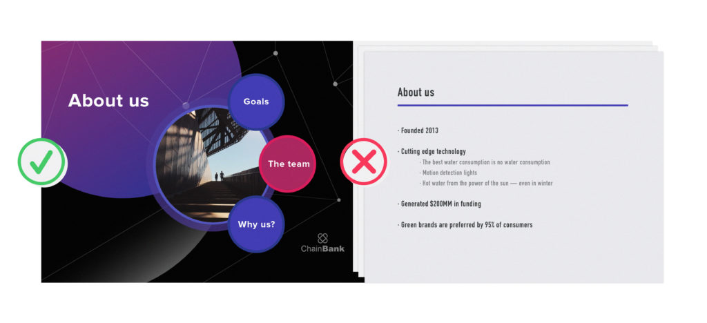
Prezi presentations employ structures that visually set the stage, so instead of telling your prospect what they’re about to hear, you can ask them where they’d like to start.
Versus:
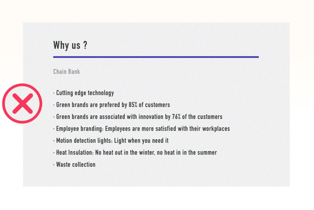
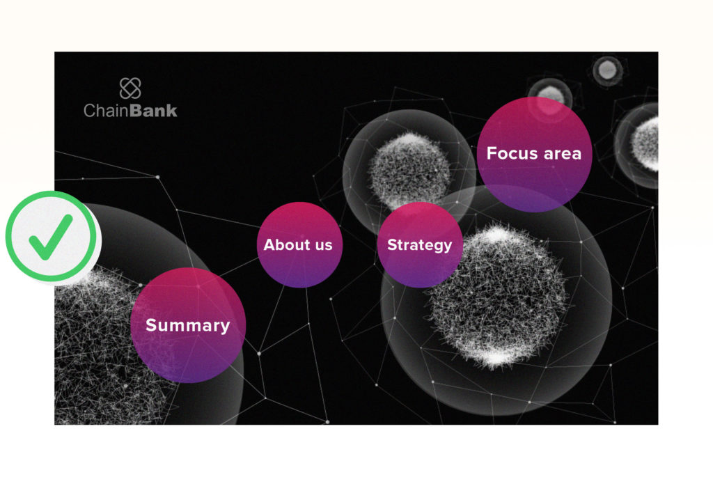
The conversational presentation style allows you to navigate directly to the most relevant part of the presentation, rather than following a preset order.
Versus:
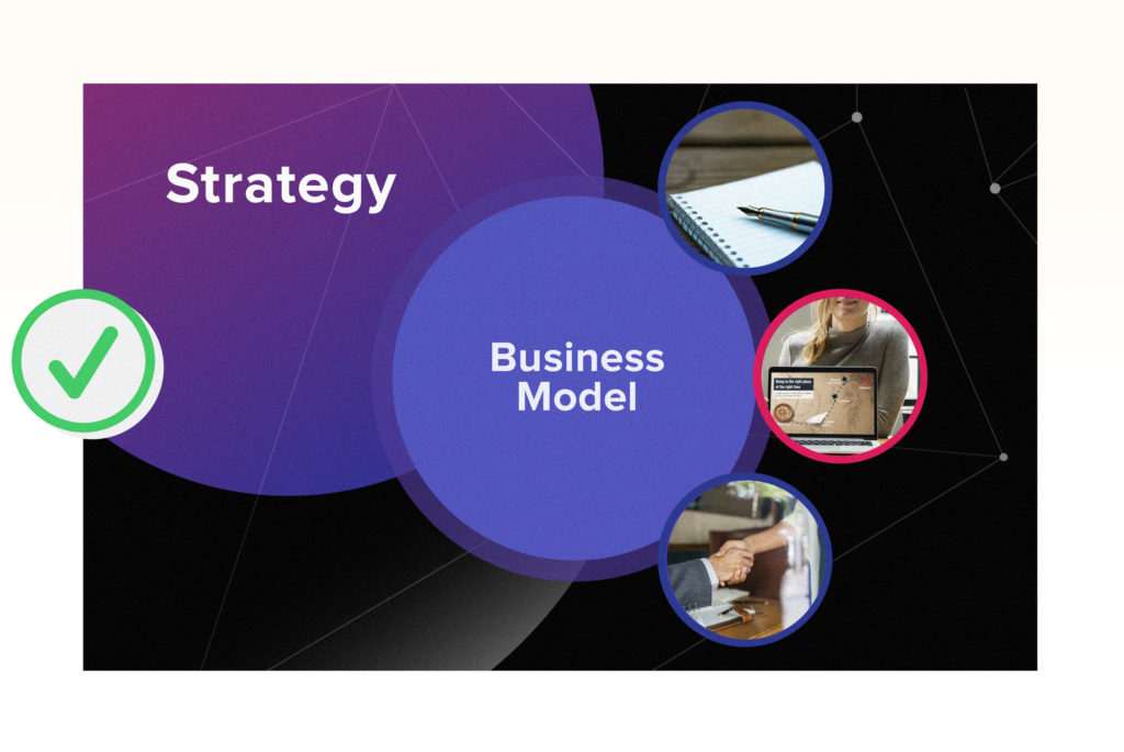
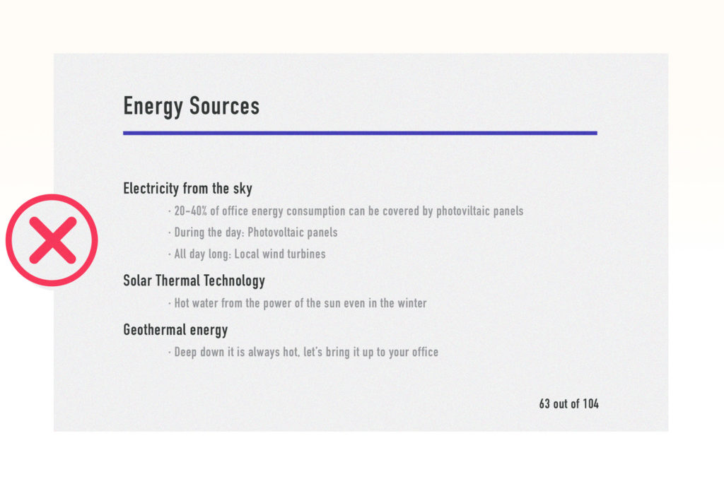
By changing up the presentation style and focusing on a visual impact rather than bullet points, reps can create a fully-customizable pitch experience that truly resonates with today’s consumer.
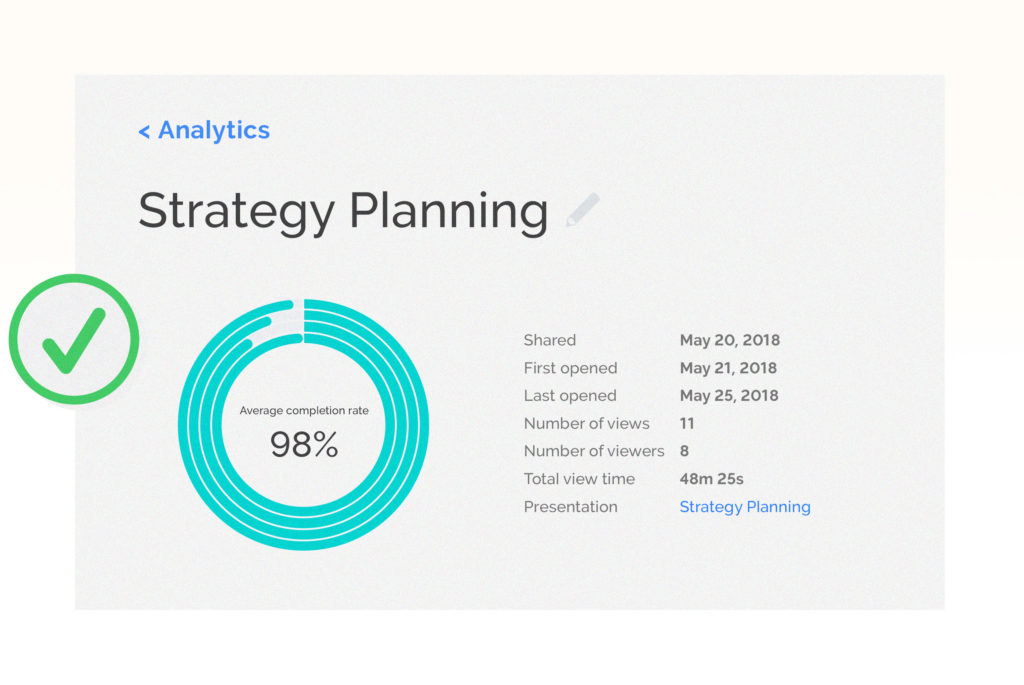
Prezi also features analytics, which tell you how engaging and memorable your presentation is outside of the meeting room. Imagine knowing who the presentation was sent to, and which sections were viewed the most/least. (Check out other creative ways to use our business analytics.)
This post is a part of Prezi’s “Do This, Not That” series, which offers insight, best practices, and the most important dos and don’ts for common business presentations.
If you found these presentation tips useful, check out:
